Introduction
You are working in a consulting company as a data scientis. The project you were currently assigned to has data from students who have recently finished courses about finances. The financial company that conducts the courses wants to understand if there are common factors that influence students to purchase the same courses or to purchase different courses. By understanding those factors, the company can create a student profile, classify each student by profile and recommend a list of courses.
When inspecting data from different student groups, you’ve come across three dispositions of points, as in 1, 2 and 3 below:
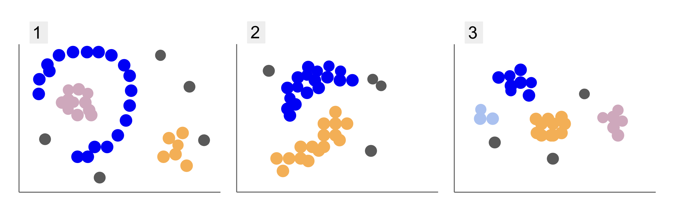
Notice that in plot 1, there are purple points organized in a half circle, with a mass of pink points inside that circle, a little concentration of orange points outside of that semi-circle, and five gray points that are far from all others.
In plot 2, there is a round mass of purple points, another of orange points, and also four gray points that are far from all the others.
And in plot 3, we can see four concentrations of points, purple, blue, orange, pink, and three more distant gray points.
Now, if you were to choose a model that could understand new student data and determine similar groups, is there a clustering algorithm that could give interesting results to that kind of data?
When describing the plots, we mentioned terms like mass of points and concentration of points, indicating that there are areas in all graphs with greater density. We also referred to circular and semi-circular shapes, which are difficult to identify by drawing a straight line or merely examining the closest points. Additionally, there are some distant points that likely deviate from the main data distribution, introducing more challenges or noise when determining the groups.
A density-based algorithm that can filter out noise, such as DBSCAN (Density-Based Spatial Clustering of Applications with Noise), is a strong choice for situations with denser areas, rounded shapes, and noise.
About DBSCAN
DBSCAN is one of the most cited algorithms in research, it’s first publication appears in 1996, this is the original DBSCAN paper. In the paper, researchers demonstrate how the algorithm can identify non-linear spatial clusters and handle data with higher dimensions efficiently.
The main idea behind DBSCAN is that there is a minimum number of points that will be within a determined distance or radius from the most “central” cluster point, called core point. The points within that radius are the neighborhood points, and the points on the edge of that neighborhood are the border points or boundary points. The radius or neighborhood distance is called epsilon neighborhood, ε-neighborhood or just ε (the symbol for Greek letter epsilon).
Additionally, when there are points that aren’t core points or border points because they exceed the radius for belonging to a determined cluster and also don’t have the minimum number of points to be a core point, they are considered noise points.
This means we have three different types of points, namely, core, border and noise. Furthermore, it is important to note that the main idea is fundamentally based on a radius or distance, which makes DBSCAN – like most clustering models – dependent on that distance metric. This metric could be Euclidean, Manhattan, Mahalanobis, and many more. Therefore, it is crucial to choose an appropriate distance metric that considers the context of the data. For instance, if you are using driving distance data from a GPS, it might be interesting to use a metric that takes the street layouts into consideration, such as Manhattan distance.

Note: Since DBSCAN maps the points that constitute noise, it can also be used as an outlier detection algorithm. For instance, if you are trying to determine which bank transactions may be fraudulent and the rate of fraudulent transactions is small, DBSCAN might be a solution to identify those points.
To find the core point, DBSCAN will first select a point at random, map all the points within its ε-neighborhood, and compare the number of neighbors of the selected point to the minimum number of points. If the selected point has an equal number or more neighbors than the minimum number of points, it will be marked as a core point. This core point and its neighborhood points will constitute the first cluster.
The algorithm will then examine each point of the first cluster and see if it has an equal number or more neighbor points than the minimum number of points within ε. If it does, those neighbor points will also be added to the first cluster. This process will continue until the points of the first cluster have fewer neighbors than the minimum number of points within ε. When that happens, the algorithm stops adding points to that cluster, identifies another core point outside of that cluster, and creates a new cluster for that new core point.
DBSCAN will then repeat the first cluster process of finding all points connected to a new core point of the second cluster until there are no more points to be added to that cluster. It will then encounter another core point and create a third cluster, or it will iterate through all the points that it hasn’t previously looked at. If these points are at ε distance from a cluster, they are added to that cluster, becoming border points. If they aren’t, they are considered noise points.
Advice: There are many rules and mathematical demonstrations involved in the idea behind DBSCAN, if you want to dig deeper, you may want to take a look at the original paper, which is linked above.
It is interesting to know how the DBSCAN algorithm works, although, fortunately, there is no need to code the algorithm, once Python’s Scikit-Learn library already has an implementation.
Let’s see how it works in practice!
Importing Data for Clustering
To see how DBSCAN works in practice, we will change projects a bit and use a small customer dataset that has the genre, age, annual income, and spending score of 200 customers.
The spending score ranges from 0 to 100 and represents how often a person spends money in a mall on a scale from 1 to 100. In other words, if a customer has a score of 0, they never spend money, and if the score is 100, they are the highest spender.
Note: You can download the dataset here.
After downloading the dataset, you will see that it is a CSV (comma-separated values) file called shopping-data.csv, we’ll load it into a DataFrame using Pandas and store it into the customer_data variable:
import pandas as pd path_to_file = '../../datasets/dbscan/dbscan-with-python-and-scikit-learn-shopping-data.csv'
customer_data = pd.read_csv(path_to_file)
To take a look at the first five rows of our data, you can execute customer_data.head():
This results in:
 CustomerID Genre Age Annual Income (k$) Spending Score (1-100)
0 1 Male 19 15 39
1 2 Male 21 15 81
2 3 Female 20 16 6
3 4 Female 23 16 77
4 5 Female 31 17 40
By examining the data, we can see customer ID numbers, genre, age, incomes in k$, and spending scores. Keep in mind that some or all of these variables will be used in the model. For example, if we were to use Age and Spending Score (1-100) as variables for DBSCAN, which uses a distance metric, it’s important to bring them to a common scale to avoid introducing distortions since Age is measured in years and Spending Score (1-100) has a limited range from 0 to 100. This means that we will perform some kind of data scaling.
We can also check if the data needs any more preprocessing aside from scaling by seeing if the type of data is consistent and verifying if there are any missing values that need to be treated by executing Panda’s info() method:
customer_data.info()
This displays:
<class 'pandas.core.frame.DataFrame'>
RangeIndex: 200 entries, 0 to 199
Data columns (total 5 columns): # Column Non-Null Count Dtype --- ------ -------------- ----- 0 CustomerID 200 non-null int64 1 Genre 200 non-null object 2 Age 200 non-null int64 3 Annual Income (k$) 200 non-null int64 4 Spending Score (1-100) 200 non-null int64 dtypes: int64(4), object(1)
memory usage: 7.9+ KB
We can observe that there are no missing values because there are 200 non-null entries for each customer feature. We can also see that only the genre column has text content, as it is a categorical variable, which is displayed as object, and all other features are numeric, of the type int64. Thus, in terms of data type consistency and absence of null values, our data is ready for further analysis.
We can proceed to visualize the data and determine which features would be interesting to use in DBSCAN. After selecting those features, we can scale them.
This customer dataset is the same as the one used in our definitive guide to hierarchical clustering. To learn more about this data, how to explore it, and about distance metrics, you can take a look at Definitive Guide to Hierarchical Clustering with Python and Scikit-Learn!
Visualizing Data
By using Seaborn’s pairplot(), we can plot a scatter graph for each combination of features. Since CustomerID is just an identification and not a feature, we will remove it with drop() prior to plotting:
import seaborn as sns customer_data = customer_data.drop('CustomerID', axis=1) sns.pairplot(customer_data);
This outputs:

When looking at the combination of features produced by pairplot, the graph of Annual Income (k$) with Spending Score (1-100) seems to display around 5 groups of points. This seems to be the most promising combination of features. We can create a list with their names, select them from the customer_data DataFrame, and store the selection in the customer_data variable again for use in our future model.
selected_cols = ['Annual Income (k$)', 'Spending Score (1-100)']
customer_data = customer_data[selected_cols]
After selecting the columns, we can perform the scaling discussed in the previous section. To bring the features to the same scale or standardize them, we can import Scikit-Learn’s StandardScaler, create it, fit our data to calculate its mean and standard deviation, and transform the data by subtracting its mean and dividing it by the standard deviation. This can be done in one step with the fit_transform() method:
from sklearn.preprocessing import StandardScaler ss = StandardScaler() scaled_data = ss.fit_transform(customer_data)
The variables are now scaled, and we can examine them by simply printing the content of the scaled_data variable. Alternatively, we can also add them to a new scaled_customer_data DataFrame along with column names and use the head() method again:
scaled_customer_data = pd.DataFrame(columns=selected_cols, data=scaled_data)
scaled_customer_data.head()
This outputs:
 Annual Income (k$) Spending Score (1-100)
0 -1.738999 -0.434801
1 -1.738999 1.195704
2 -1.700830 -1.715913
3 -1.700830 1.040418
4 -1.662660 -0.395980
This data is ready for clustering! When introducing DBSCAN, we mentioned the minimum number of points and the epsilon. These two values need to be selected prior to creating the model. Let’s see how it’s done.
Choosing Min. Samples and Epsilon
To choose the minimum number of points for DBSCAN clustering, there is a rule of thumb, which states that it has to be equal or higher than the number of dimensions in the data plus one, as in:
$$
text{min. points} >= text{data dimensions} + 1
$$
The dimensions are the number of columns in the dataframe, we are using 2 columns, so the min. points should be either 2+1, which is 3, or higher. For this example, let’s use 5 min. points.
$$
text{5 (min. points)} >= text{2 (data dimensions)} + 1
$$
Check out our hands-on, practical guide to learning Git, with best-practices, industry-accepted standards, and included cheat sheet. Stop Googling Git commands and actually learn it!
Now, to choose the value for ε there is a method in which a Nearest Neighbors algorithm is employed to find the distances of a predefined number of nearest points for each point. This predefined number of neighbors is the min. points we have just chosen minus 1. So, in our case, the algorithm will find the 5-1, or 4 nearest points for each point of our data. those are the k-neighbors and our k equals 4.
$$
text{k-neighbors} = text{min. points} – 1
$$
After finding the neighbors, we will order their distances from largest to smallest and plot the distances of the y-axis and the points on the x-axis. Looking at the plot, we will find where it resembles the bent of an elbow and the y-axis point that describes that elbow bent is the suggested ε value.
Note: it is possible that the graph for finding the ε value has either one or more “elbow bents”, either big or mini, when that happens, you can find the values, test them and choose those with results that best describe the clusters, either by looking at metrics of plots.
To perform these steps, we can import the algorithm, fit it to the data, and then we can extract the distances and indices of each point with kneighbors() method:
from sklearn.neighbors import NearestNeighbors
import numpy as np nn = NearestNeighbors(n_neighbors=4) nbrs = nn.fit(scaled_customer_data)
distances, indices = nbrs.kneighbors(scaled_customer_data)
After finding the distances, we can sort them from largest to smallest. Since the distances array’s first column is of the point to itself (meaning all are 0), and the second column contains the smallest distances, followed by the third column which has larger distances than the second, and so on, we can pick only the values of the second column and store them in the distances variable:
distances = np.sort(distances, axis=0)
distances = distances[:,1]
Now that we have our sorted smallest distances, we can import matplotlib, plot the distances, and draw a red line on where the “elbow bend” is:
import matplotlib.pyplot as plt plt.figure(figsize=(6,3))
plt.plot(distances)
plt.axhline(y=0.24, color='r', linestyle='--', alpha=0.4) plt.title('Kneighbors distance graph')
plt.xlabel('Data points')
plt.ylabel('Epsilon value')
plt.show();
This is the result:

Notice that when drawing the line, we will find out the ε value, in this case, it is 0.24.
We finally have our minimum points and ε. With both variables, we can create and run the DBSCAN model.
Creating a DBSCAN Model
To create the model, we can import it from Scikit-Learn, create it with ε which is the same as the eps argument, and the minimum points to which is the mean_samples argument. We can then store it into a variable, let’s call it dbs and fit it to the scaled data:
from sklearn.cluster import DBSCAN dbs = DBSCAN(eps=0.24, min_samples=5)
dbs.fit(scaled_customer_data)
Just like that, our DBSCAN model has been created and trained on the data! To extract the results, we access the labels_ property. We can also create a new labels column in the scaled_customer_data dataframe and fill it with the predicted labels:
labels = dbs.labels_ scaled_customer_data['labels'] = labels
scaled_customer_data.head()
This is the final result:
 Annual Income (k$) Spending Score (1-100) labels
0 -1.738999 -0.434801 -1
1 -1.738999 1.195704 0
2 -1.700830 -1.715913 -1
3 -1.700830 1.040418 0
4 -1.662660 -0.395980 -1
Observe that we have labels with -1 values; these are the noise points, the ones that don’t belong to any cluster. To know how many noise points the algorithm found, we can count how many times the value -1 appears in our labels list:
labels_list = list(scaled_customer_data['labels'])
n_noise = labels_list.count(-1)
print("Number of noise points:", n_noise)
This outputs:
Number of noise points: 62
We already know that 62 points of our original data of 200 points were considered noise. This is a lot of noise, which indicates that perhaps the DBSCAN clustering didn’t consider many points as part of a cluster. We will understand what happened soon, when we plot the data.
Initially, when we observed the data, it seemed to have 5 clusters of points. To know how many clusters DBSCAN has formed, we can count the number of labels that are not -1. There are many ways to write that code; here, we have written a for loop, which will also work for data in which DBSCAN has found many clusters:
total_labels = np.unique(labels) n_labels = 0
for n in total_labels: if n != -1: n_labels += 1
print("Number of clusters:", n_labels)
This outputs:
Number of clusters: 6
We can see that the algorithm predicted the data to have 6 clusters, with many noise points. Let’s visualize that by plotting it with seaborn’s scatterplot:
sns.scatterplot(data=scaled_customer_data, x='Annual Income (k$)', y='Spending Score (1-100)', hue='labels', palette='muted').set_title('DBSCAN found clusters');
This results in:

Looking at the plot, we can see that DBSCAN has captured the points which were more densely connected, and points that could be considered part of the same cluster were either noise or considered to form another smaller cluster.

If we highlight the clusters, notice how DBSCAN gets cluster 1 completely, which is the cluster with less space between points. Then it gets the parts of clusters 0 and 3 where the points are closely together, considering more spaced points as noise. It also considers the points in the lower left half as noise and splits the points in the lower right into 3 clusters, once again capturing clusters 4, 2, and 5 where the points are closer together.
We can start to come to a conclusion that DBSCAN was great for capturing the dense areas of the clusters but not so much for identifying the bigger scheme of the data, the 5 clusters’ delimitations. It would be interesting to test more clustering algorithms with our data. Let’s see if a metric will corroborate this hypothesis.
Evaluating the Algorithm
To evaluate DBSCAN we will use the silhouette score which will take into consideration the distance between points of a same cluster and the distances between clusters.
Note: Currently, most clustering metrics aren’t really fitted to be used to evaluate DBSCAN because they aren’t based on density. Here, we are using the silhouette score because it is already implemented in Scikit-learn and because it tries to look at cluster shape.
To have a more fitted evaluation, you can use or combine it with the Density-Based Clustering Validation (DBCV) metric, which was designed specifically for density-based clustering. There is an implementation for DBCV available on this GitHub.
First, we can import silhouette_score from Scikit-Learn, then, pass it our columns and labels:
from sklearn.metrics import silhouette_score s_score = silhouette_score(scaled_customer_data, labels)
print(f"Silhouette coefficient: {s_score:.3f}")
This outputs:
Silhouette coefficient: 0.506
According to this score, it seems DBSCAN could capture approximately 50% of the data.
Conclusion
DBSCAN Advantages and Disadvantages
DBSCAN is a very unique clustering algorithm or model.
If we look at its advantages, it is very good at picking up dense areas in data and points that are far from others. This means that the data doesn’t have to have a specific shape and can be surrounded by other points, as long as they are also densely connected.
It requires us to specify minimum points and ε, but there is no need to specify the number of clusters beforehand, as in K-Means, for instance. It can also be used with very large databases since it was designed for high-dimensional data.
As for its disadvantages, we have seen that it couldn’t capture different densities in the same cluster, so it has a hard time with large differences in densities. It is also dependent on the distance metric and scaling of the points. This means that if the data isn’t well understood, with differences in scale and with a distance metric that doesn’t make sense, it will probably fail to understand it.
DBSCAN Extensions
There are other algorithms, such as Hierarchical DBSCAN (HDBSCAN) and Ordering points to identify the clustering structure (OPTICS), which are considered extensions of DBSCAN.
Both HDBSCAN and OPTICS can usually perform better when there are clusters of varying densities in the data and are also less sensitive to the choice or initial min. points and ε parameters.
- SEO Powered Content & PR Distribution. Get Amplified Today.
- Platoblockchain. Web3 Metaverse Intelligence. Knowledge Amplified. Access Here.
- Source: https://stackabuse.com/dbscan-with-scikit-learn-in-python/
- :is
- $UP
- 1
- 10
- 100
- 11
- 1996
- 39
- 7
- 77
- 8
- 9
- a
- About
- above
- access
- across
- actually
- added
- Additionally
- advantages
- After
- Alert
- algorithm
- algorithms
- All
- already
- Although
- analysis
- and
- annual
- Another
- appropriate
- approximately
- ARE
- areas
- argument
- around
- Array
- AS
- assigned
- At
- available
- avoid
- Bank
- BANK TRANSACTIONS
- based
- BE
- because
- becoming
- behind
- below
- BEST
- Better
- between
- Big
- bigger
- Bit
- Blue
- border
- bring
- by
- calculate
- call
- called
- CAN
- capture
- Capturing
- case
- central
- challenges
- change
- check
- choice
- Choose
- chosen
- Circle
- cited
- class
- Classify
- closely
- closer
- Cluster
- clustering
- code
- Column
- Columns
- combination
- combine
- come
- Common
- company
- compare
- completely
- concentration
- conclusion
- conducts
- connected
- Consider
- consideration
- considered
- considering
- considers
- consistent
- constitute
- consulting
- contains
- content
- context
- continue
- Core
- corroborate
- could
- courses
- create
- created
- creates
- Creating
- crucial
- Currently
- customer
- Customers
- data
- data points
- databases
- DBS
- deeper
- definitive
- demonstrate
- density
- dependent
- describe
- designed
- Detection
- Determine
- determined
- determining
- deviation
- differences
- different
- difficult
- DIG
- dimensions
- discussed
- Display
- displays
- distance
- Distant
- distribution
- download
- drawing
- driving
- each
- Edge
- efficiently
- either
- encounter
- Equals
- evaluate
- evaluation
- Examining
- example
- exceed
- execute
- executing
- explore
- extensions
- extract
- factors
- FAIL
- far
- Feature
- Features
- female
- File
- fill
- filter
- final
- Finally
- Finances
- financial
- Find
- finding
- First
- fit
- Focus
- followed
- For
- form
- formed
- Fortunately
- found
- FRAME
- fraudulent
- from
- fundamentally
- further
- Furthermore
- future
- Git
- Give
- good
- gps
- graph
- graphs
- gray
- great
- greater
- Group’s
- guide
- Half
- handle
- hands-on
- happened
- happens
- Hard
- Have
- here
- higher
- highest
- Highlight
- hover
- How
- How To
- HTTPS
- ICON
- ID
- idea
- Identification
- identifies
- identify
- identifying
- implementation
- implemented
- import
- important
- in
- In other
- included
- Income
- indicates
- Indices
- influence
- initial
- instance
- interesting
- introducing
- Introduction
- involved
- IT
- ITS
- itself
- Keep
- Kind
- Know
- Labels
- large
- larger
- largest
- LEARN
- learning
- letter
- LG
- Library
- like
- likely
- Limited
- Line
- linked
- List
- little
- load
- Long
- Look
- looked
- looking
- Lot
- Main
- make
- MAKES
- many
- map
- Maps
- marked
- Mass
- mathematical
- matplotlib
- meaning
- means
- Memory
- mentioned
- merely
- method
- metric
- Metrics
- might
- mind
- minimum
- missing
- model
- models
- money
- more
- most
- namely
- names
- Need
- needs
- neighbors
- New
- Noise
- number
- numbers
- numpy
- object
- observe
- of
- on
- ONE
- optics
- Orange
- order
- Organized
- original
- Other
- Others
- outside
- pandas
- Paper
- parameters
- part
- parts
- perform
- perhaps
- person
- pick
- plato
- Plato Data Intelligence
- PlatoData
- plus
- Point
- points
- possible
- Practical
- practice
- predicted
- previous
- previously
- Prior
- probably
- process
- Produced
- Profile
- project
- projects
- promising
- property
- Publication
- purchase
- Python
- random
- range
- Rate
- ready
- recently
- recommend
- Red
- referred
- remove
- repeat
- represents
- requires
- research
- researchers
- resembles
- result
- Results
- Ring
- round
- Rule
- rules
- Run
- s
- same
- Scale
- scaling
- scheme
- scikit-learn
- seaborn
- Second
- Section
- seeing
- seemed
- seems
- selected
- selecting
- selection
- sense
- sensitive
- Shadow
- Shape
- shapes
- should
- similar
- simply
- since
- situations
- small
- smaller
- smallest
- So
- solution
- some
- Soon
- Space
- Spatial
- specific
- specifically
- spend
- Spending
- Splits
- Stackabuse
- standard
- standards
- start
- States
- Step
- Steps
- Stop
- Stops
- store
- straight
- street
- strong
- structure
- Student
- Students
- such
- surrounded
- SVG
- symbol
- Take
- takes
- terms
- test
- that
- The
- The Graph
- their
- Them
- therefore
- These
- Third
- three
- Through
- time
- times
- to
- together
- Total
- trained
- Transactions
- Transform
- transition
- true
- types
- understand
- understanding
- understood
- unique
- us
- Usage
- use
- usually
- value
- Values
- variables
- Ve
- verifying
- visualize
- ways
- WELL
- What
- which
- WHO
- will
- with
- within
- words
- Work
- working
- works
- would
- write
- written
- years
- zephyrnet