
The wave is probably one of the most difficult shapes to make in CSS. We always try to approximate it with properties like border-radius and lots of magic numbers until we get something that feels kinda close. And that’s before we even get into wavy patterns, which are more difficult.
“SVG it!” you might say, and you are probably right that it’s a better way to go. But we will see that CSS can make nice waves and the code for it doesn’t have to be all crazy. And guess what? I have an online generator to make it even more trivial!
If you play with the generator, you can see that the CSS it spits out is only two gradients and a CSS mask property — just those two things and we can make any kind of wave shape or pattern. Not to mention that we can easily control the size and the curvature of the waves while we’re at it.
Some of the values may look like “magic numbers” but there’s actually logic behind them and we will dissect the code and discover all the secrets behind creating waves.
This article is a follow-up to a previous one where I built all kinds of different zig-zag, scoped, scalloped, and yes, wavy border borders. I highly recommend checking that article as it uses the same technique we will cover here, but in greater detail.
The math behind waves
Strictly speaking, there isn’t one magic formula behind wavy shapes. Any shape with curves that go up and down can be called a wave, so we are not going to restrict ourselves to complex math. Instead, we will reproduce a wave using the basics of geometry.
Let’s start with a simple example using two circle shapes:
We have two circles with the same radius next to each other. Do you see that red line? It covers the top half of the first circle and the bottom half of the second one. Now imagine you take that line and repeat it.
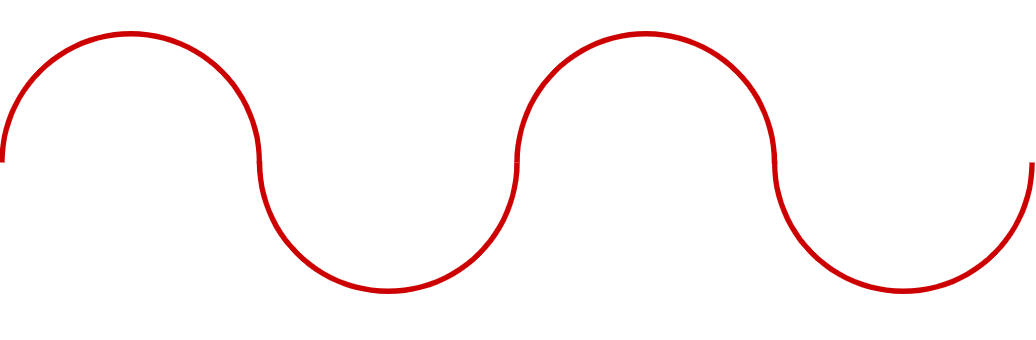
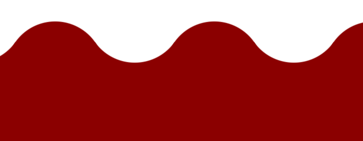
We already see the wave. Now let’s fill the bottom part (or the top one) to get the following:

Tada! We have a wavy shape, and one that we can control using one variable for the circle radii. This is one of the easiest waves we can make and it’s the one I showed off in this previous article
Let’s add a bit of complexity by taking the first illustration and moving the circles a little:

We still have two circles with the same radii but they are no longer horizontally aligned. In this case, the red line no longer covers half the area of each circle, but a smaller area instead. This area is limited by the dashed red line. That line crosses the point where both circles meet.
Now take that line and repeat it and you get another wave, a smoother one.
I think you get the idea. By controlling the position and size of the circles, we can create any wave we want. We can even create variables for them, which I will call P and S, respectively.

You have probably noticed that, in the online generator, we control the wave using two inputs. They map to the above variables. S is the “Size of the wave” and P is the “curvature of the wave”.
I am defining P as P = m*S where m is the variable you adjust when updating the curvature of the wave. This allows us to always have the same curvature, even if we update S.
m can be any value between 0 and 2. 0 will give us the first particular case where both circles are aligned horizontally. 2 is a kind of maximum value. We can go bigger, but after a few tests I found that anything above 2 produces bad, flat shapes.
Let’s not forget the radius of our circle! That can also be defined using S and P like this:
R = sqrt(P² + S²)/2When P is equal to 0, we will have R = S/2.
We have everything to start converting all of this into gradients in CSS!
Creating gradients
Our waves use circles, and when talking about circles we talk about radial gradients. And since two circles define our wave, we will logically be using two radial gradients.
We will start with the particular case where P is equal to 0. Here is the illustration of the first gradient:
This gradient creates the first curvature while filling in the entire bottom area —the “water” of the wave so to speak.

.wave {
  --size: 50px;

  mask: radial-gradient(var(--size) at 50% 0%, #0000 99%, red 101%)
    50% var(--size)/calc(4 * var(--size)) 100% repeat-x;
}
The --size variable defines the radius and the size of the radial gradient. If we compare it with the S variable, then it’s equal to S/2.
Now let’s add the second gradient:
The second gradient is nothing but a circle to complete our wave:
radial-gradient(var(--size) at 50% var(--size), blue 99%, #0000 101%)
  calc(50% - 2*var(--size)) 0/calc(4 * var(--size)) 100%
If you check the previous article you will see that I am simply repeating what I already did there.
I followed both articles but the gradient configurations are not the same.
That’s because we can reach the same result using different gradient configurations. You will notice a slight difference in the alignment if you compare both configurations, but the trick is the same. This can be confusing if you are unfamiliar with gradients, but don’t worry. With some practice, you get used to them and you will find by yourself that different syntax can lead to the same result.
Here is the full code for our first wave:
.wave {
  --size: 50px;

  mask:
    radial-gradient(var(--size) at 50% var(--size),#000 99%, #0000 101%)
      calc(50% - 2*var(--size)) 0/calc(4 * var(--size)) 100%,
    radial-gradient(var(--size) at 50% 0px, #0000 99%, #000 101%)
      50% var(--size)/calc(4 * var(--size)) 100% repeat-x;
}
Now let’s take this code and adjust it to where we introduce a variable that makes this fully reusable for creating any wave we want. As we saw in the previous section, the main trick is to move the circles so they are no more aligned so let’s update the position of each one. We will move the first one up and the second down.
Our code will look like this:
.wave {
  --size: 50px;
  --p: 25px;

  mask:
    radial-gradient(var(--size) at 50% calc(var(--size) + var(--p)), #000 99%, #0000 101%)
      calc(50% - 2*var(--size)) 0/calc(4 * var(--size)) 100%,
    radial-gradient(var(--size) at 50% calc(-1*var(--p)), #0000 99%, #000 101%)
      50% var(--size) / calc(4 * var(--size)) 100% repeat-x;
}
I have introduced a new --p variable that’s used it to define the center position of each circle. The first gradient is using 50% calc(-1*var(--p)), so its center moves up while the second one is using calc(var(--size) + var(--p)) to move it down.
A demo is worth a thousand words:
The circles are neither aligned nor touch one another. We spaced them far apart without changing their radii, so we lost our wave. But we can fix things up by using the same math we used earlier to calculate the new radius. Remember that R = sqrt(P² + S²)/2. In our case, --size is equal to S/2; the same for --p which is also equal to P/2 since we are moving both circles. So, the distance between their center points is double the value of --p for this:
R = sqrt(var(--size) * var(--size) + var(--p) * var(--p))That gives us a result of 55.9px.
Our wave is back! Let’s plug that equation into our CSS:
.wave {
  --size: 50px;
  --p: 25px;
  --R: sqrt(var(--p) * var(--p) + var(--size)*var(--size));

  mask:
    radial-gradient(var(--R) at 50% calc(var(--size) + var(--p)), #000 99%, #0000 101%)
      calc(50% - 2*var(--size)) 0 / calc(4 * var(--size)) 100%,
    radial-gradient(var(--R) at 50% calc(-1*var(--p)), #0000 99%, #000 101%)
      50% var(--size)/calc(4 * var(--size)) 100% repeat-x;
}
This is valid CSS code. sqrt() is part of the specification, but at the time I’m writing this, there is no browser support for it. That means we need a sprinkle of JavaScript or Sass to calculate that value until we get broader sqrt() support.
This is pretty darn cool: all it takes is two gradients to get a cool wave that you can apply to any element using the mask property. No more trial and error — all you need is to update two variables and you’re good to go!
Reversing the wave
What if we want the waves going the other direction, where we’re filling in the “sky” instead of the “water”. Believe it or not, all we have to do is to update two values:
.wave {
  --size: 50px;
  --p: 25px;
  --R: sqrt(var(--p) * var(--p) + var(--size) * var(--size));

  mask:
    radial-gradient(var(--R) at 50% calc(100% - (var(--size) + var(--p))), #000 99%, #0000 101%)
      calc(50% - 2 * var(--size)) 0/calc(4 * var(--size)) 100%,
    radial-gradient(var(--R) at 50% calc(100% + var(--p)), #0000 99%, #000 101%)
      50% calc(100% - var(--size)) / calc(4 * var(--size)) 100% repeat-x;
}
All I did there is add an offset equal to 100%, highlighted above. Here’s the result:
We can consider a more friendly syntax using keyword values to make it even easier:
.wave {
  --size: 50px;
  --p: 25px;
  --R: sqrt(var(--p)*var(--p) + var(--size) * var(--size));

  mask:
    radial-gradient(var(--R) at left 50% bottom calc(var(--size) + var(--p)), #000 99%, #0000 101%)
      calc(50% - 2 * var(--size)) 0/calc(4 * var(--size)) 100%,
    radial-gradient(var(--R) at left 50% bottom calc(-1 * var(--p)), #0000 99%, #000 101%)
      left 50% bottom var(--size) / calc(4 * var(--size)) 100% repeat-x;
}
We’re using the left and bottom keywords to specify the sides and the offset. By default, the browser defaults to left and top — that’s why we use 100% to move the element to the bottom. In reality, we are moving it from the top by 100%, so it’s really the same as saying bottom. Much easier to read than math!
With this updated syntax, all we have to do is to swap bottom for top — or vice versa — to change the direction of the wave.
And if you want to get both top and bottom waves, we combine all the gradients in a single declaration:
.wave {
  --size: 50px;
  --p: 25px;
  --R: sqrt(var(--p)*var(--p) + var(--size)*var(--size));

  mask:
    /* Gradient 1 */
    radial-gradient(var(--R) at left 50% bottom calc(var(--size) + var(--p)), #000 99%, #0000 101%)
      left calc(50% - 2*var(--size)) bottom 0 / calc(4 * var(--size)) 51% repeat-x,
    /* Gradient 2 */
    radial-gradient(var(--R) at left 50% bottom calc(-1 * var(--p)), #0000 99%, #000 101%)
      left 50% bottom var(--size) / calc(4 * var(--size)) calc(51% - var(--size)) repeat-x,
    /* Gradient 3 */
    radial-gradient(var(--R) at left 50% top calc(var(--size) + var(--p)), #000 99%, #0000 101%)
      left calc(50% - 2 * var(--size)) top 0 / calc(4 * var(--size)) 51% repeat-x,
    /* Gradient 4 */
    radial-gradient(var(--R) at left 50% top calc(-1 * var(--p)), #0000 99%, #000 101%)
      left 50% top var(--size) / calc(4 * var(--size)) calc(51% - var(--size)) repeat-x;
}
If you check the code, you will see that in addition to combining all the gradients, I have also reduced their height from 100% to 51% so that they both cover half of the element. Yes, 51%. We need that little extra percent for a small overlap that avoid gaps.
What about the left and right sides?
It’s your homework! Take what we did with the top and bottom sides and try to update the values to get the right and left values. Don’t worry, it’s easy and the only thing you need to do is to swap values.
If you have trouble, you can always use the online generator to check the code and visualize the result.
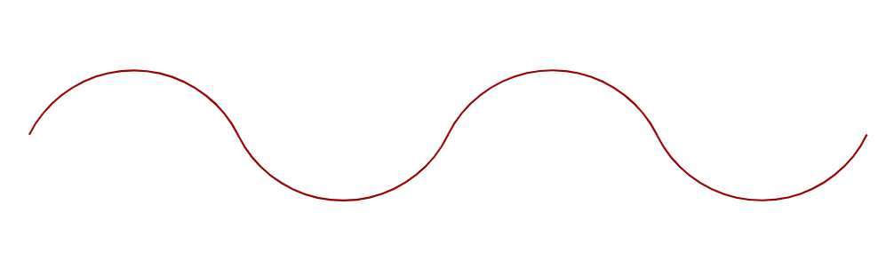
Wavy lines
Earlier, we made our first wave using a red line then filled the bottom portion of the element. How about that wavy line? That’s a wave too! Even better is if we can control its thickness with a variable so we can reuse it. Let’s do it!
We are not going to start from scratch but rather take the previous code and update it. The first thing to do is to update the color stops of the gradients. Both gradients start from a transparent color to an opaque one, or vice versa. To simulate a line or border, we need to start from transparent, go to opaque, then back to transparent again:
#0000 calc(99% - var(--b)), #000 calc(101% - var(--b)) 99%, #0000 101%I think you already guessed that the --b variable is what we’re using to control the line thickness. Let’s apply this to our gradients:
Yeah, the result is far from a wavy line. But looking closely, we can see that one gradient is correctly creating the bottom curvature. So, all we really need to do is rectify the second gradient. Instead of keeping a full circle, let’s make partial one like the other gradient.
Still far, but we have both curvatures we need! If you check the code, you will see that we have two identical gradients. The only difference is their positioning:
.wave {
  --size: 50px;
  --b: 10px;
  --p: 25px;
  --R: sqrt(var(--p)*var(--p) + var(--size)*var(--size));

  --_g: #0000 calc(99% - var(--b)), #000 calc(101% - var(--b)) 99%, #0000 101%;
  mask:
    radial-gradient(var(--R) at left 50% bottom calc(-1*var(--p)), var(--_g))
      calc(50% - 2*var(--size)) 0/calc(4*var(--size)) 100%,
    radial-gradient(var(--R) at left 50% top    calc(-1*var(--p)), var(--_g))
      50% var(--size)/calc(4*var(--size)) 100%;
}
Now we need to adjust the size and position for the final shape. We no longer need the gradient to be full-height, so we can replace 100% with this:
/* Size plus thickness */
calc(var(--size) + var(--b))
There is no mathematical logic behind this value. It only needs to be big enough for the curvature. We will see its effect on the pattern in just a bit. In the meantime, let’s also update the position to vertically center the gradients:
.wave {
  --size: 50px;
  --b: 10px;
  --p: 25px;
  --R: sqrt(var(--p)*var(--p) + var(--size)*var(--size));

  --_g: #0000 calc(99% - var(--b)), #000 calc(101% - var(--b)) 99%, #0000 101%;
  mask:
    radial-gradient(var(--R) at left 50% bottom calc(-1*var(--p)), var(--_g))
      calc(50% - 2*var(--size)) 50%/calc(4 * var(--size)) calc(var(--size) + var(--b)) no-repeat,
    radial-gradient(var(--R) at left 50% top calc(-1 * var(--p)), var(--_g)) 50%
      50%/calc(4 * var(--size)) calc(var(--size) + var(--b)) no-repeat;
}
Still not quite there:
One gradient needs to move a bit down and the other a bit up. Both need to move by half of their height.
We are almost there! We need a small fix for the radius to have a perfect overlap. Both lines need to offset by half the border (--b) thickness:
We got it! A perfect wavy line that we can easily adjust by controlling a few variables:
.wave {
  --size: 50px;
  --b: 10px;
  --p: 25px;
  --R: calc(sqrt(var(--p) * var(--p) + var(--size) * var(--size)) + var(--b) / 2);

  --_g: #0000 calc(99% - var(--b)), #000 calc(101% - var(--b)) 99%, #0000 101%;
  mask:
    radial-gradient(var(--R) at left 50% bottom calc(-1 * var(--p)), var(--_g))
     calc(50% - 2*var(--size)) calc(50% - var(--size)/2 - var(--b)/2) / calc(4 * var(--size)) calc(var(--size) + var(--b)) repeat-x,
    radial-gradient(var(--R) at left 50% top calc(-1*var(--p)),var(--_g))
     50%  calc(50% + var(--size)/2 + var(--b)/2) / calc(4 * var(--size)) calc(var(--size) + var(--b)) repeat-x;
}
I know that the logic takes a bit to grasp. That’s fine and as I said, creating a wavy shape in CSS is not easy, not to mention the tricky math behind it. That’s why the online generator is a lifesaver — you can easily get the final code even if you don’t fully understand the logic behind it.
Wavy patterns
We can make a pattern from the wavy line we just created!
Oh no, the code of the pattern will be even more difficult to understand!
Not at all! We already have the code. All we need to do is to remove repeat-x from what we already have, and tada. 🎉
A nice wavy pattern. Remember the equation I said we’d revisit?
/* Size plus thickness */
calc(var(--size) + var(--b))
Well, this is what controls the distance between the lines in the pattern. We can make a variable out of it, but there’s no need for more complexity. I’m not even using a variable for that in the generator. Maybe I’ll change that later.
Here is the same pattern going in a different direction:
I am providing you with the code in that demo, but I’d for you to dissect it and understand what changes I made to make that happen.
Simplifying the code
In all the previous demos, we always define the --size and --p independently. But do you recall how I mentioned earlier that the online generator evaluates P as equal to m*S, where m controls the curvature of the wave? By defining a fixed multiplier, we can work with one particular wave and the code can become easier. This is what we will need in most cases: a specific wavy shape and a variable to control its size.
Let’s update our code and introduce the m variable:
.wave {
  --size: 50px;
  --R: calc(var(--size) * sqrt(var(--m) * var(--m) + 1));

  mask:
    radial-gradient(var(--R) at 50% calc(var(--size) * (1 + var(--m))), #000 99%, #0000 101%)
      calc(50% - 2*var(--size)) 0/calc(4 * var(--size)) 100%,
    radial-gradient(var(--R) at 50% calc(-1 * var(--size) * var(--m)), #0000 99%, #000 101%)
      50% var(--size) / calc(4 * var(--size)) 100% repeat-x;
  }
As you can see, we no longer need the --p variable. I replaced it with var(--m)*var(--size), and optimized some of the math accordingly. Now, If we want to work with a particular wavy shape, we can omit the --m variable and replace it with a fixed value. Let’s try .8 for example.
--size: 50px;
--R: calc(var(--size) * 1.28);

mask:
  radial-gradient(var(--R) at 50% calc(1.8 * var(--size)), #000 99%, #0000 101%)
    calc(50% - 2*var(--size)) 0/calc(4 * var(--size)) 100%,
  radial-gradient(var(--R) at 50% calc(-.8 * var(--size)), #0000 99%, #000 101%)
    50% var(--size) / calc(4 * var(--size)) 100% repeat-x;
See how the code is easier now? Only one variable to control your wave, plus you no more need to rely on sqrt() which has no browser support!
You can apply the same logic to all the demos we saw even for the wavy lines and the pattern. I started with a detailed mathmatical explanation and gave the generic code, but you may find yourself needing easier code in a real use case. This is what I am doing all the time. I rarely use the generic code, but I always consider a simplified version especially that, in most of the cases, I am using some known values that don’t need to be stored as variables. (Spoiler alert: I will be sharing a few examples at the end!)
Limitations to this approach
Mathematically, the code we made should give us perfect wavy shapes and patterns, but in reality, we will face some strange results. So, yes, this method has its limitations. For example, the online generator is capable of producing poor results, especially with wavy lines. Part of the issue is due to a particular combination of values where the result gets scrambled, like using a big value for the border thickness compared to the size:

For the other cases, it’s the issue related to some rounding that will results in misalignment and gaps between the waves:

That said, I still think the method we covered remains a good one because it produces smooth waves in most cases, and we can easily avoid the bad results by playing with different values until we get it perfect.
Wrapping up
I hope that after this article, you will no more to fumble around with trial and error to build a wavy shape or pattern. In addition to the online generator, you have all the math secrets behind creating any kind of wave you want!
The article ends here but now you have a powerful tool to create fancy designs that use wavy shapes. Here’s inspiration to get you started…
What about you? Use my online generator (or write the code manually if you already learned all the math by heart) and show me your creations! Let’s have a good collection in the comment section.