Introduction
At the heart of data science lies statistics, which has existed for centuries yet remains fundamentally essential in today’s digital age. Why? Because basic statistics concepts are the backbone of data analysis, enabling us to make sense of the vast amounts of data generated daily. It’s like conversing with data, where statistics helps us ask the right questions and understand the stories data tries to tell.
From predicting future trends and making decisions based on data to testing hypotheses and measuring performance, statistics is the tool that powers the insights behind data-driven decisions. It’s the bridge between raw data and actionable insights, making it an indispensable part of data science.
In this article, I have compiled top 15 fundamental statistics concepts that every data science beginner should know!

Table of contents
1. Statistical Sampling and Data Collection
We will learn some basic statistics concepts, but understanding where our data comes from and how we gather it is essential before diving deep into the ocean of data. This is where populations, samples, and various sampling techniques come into play.
Imagine we want to know the average height of people in a city. It’s practical to measure everyone, so we take a smaller group (sample) representing the larger population. The trick lies in how we select this sample. Techniques such as random, stratified, or cluster sampling ensure our sample is represented well, minimizing bias and making our findings more reliable.
By understanding populations and samples, we can confidently extend our insights from the sample to the whole population, making informed decisions without the need to survey everyone.
2. Types of Data and Measurement Scales
Data comes in various flavors, and knowing the type of data you’re dealing with is crucial for choosing the right statistical tools and techniques.
Quantitative & Qualitative Data
- Quantitative Data: This type of data is all about numbers. It’s measurable and can be used for mathematical calculations. Quantitative data tells us “how much” or “how many,” like the number of users visiting a website or the temperature in a city. It’s straightforward and objective, providing a clear picture through numerical values.
- Qualitative Data: Conversely, qualitative data deals with characteristics and descriptions. It’s about “what type” or “which category.” Think of it as the data that describes qualities or attributes, such as the color of a car or the genre of a book. This data is subjective, based on observations rather than measurements.
Four Scales of Measurement
- Nominal Scale: This is the simplest form of measurement used for categorizing data without a specific order. Examples include types of cuisine, blood groups, or nationality. It’s about labeling without any quantitative value.
- Ordinal Scale: Data can be ordered or ranked here, but the intervals between values aren’t defined. Think of a satisfaction survey with options like satisfied, neutral, and unsatisfied. It tells us the order but not the distance between the rankings.
- Interval Scale: Interval scales order data and quantify the difference between entries. However, there’s no actual zero point. A good example is temperature in Celsius; the difference between 10°C and 20°C is the same as between 20°C and 30°C, but 0°C doesn’t mean the absence of temperature.
- Ratio Scale: The most informative scale has all the properties of an interval scale plus a meaningful zero point, allowing for an accurate comparison of magnitudes. Examples include weight, height, and income. Here, we can say something is twice as much as another.
3. Descriptive Statistics
Imagine descriptive statistics as your first date with your data. It’s about getting to know the basics, the broad strokes that describe what’s in front of you. Descriptive statistics has two main types: central tendency and variability measures.
Measures of Central Tendency: These are like the data’s center of gravity. They give us a single value typical or representative of our data set.
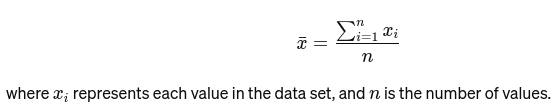
Mean: The average is calculated by adding up all the values and dividing by the number of values. It’s like the overall rating of a restaurant based on all reviews. The mathematical formula for the average is given below:
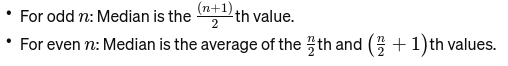
Median: The middle value when the data is ordered from smallest to largest. If the number of observations is even, it’s the average of the two middle numbers. It’s used to find the middle point of a bridge.
If n is even, the median is the average of the two central numbers.
Mode: It is the most frequently occurring value in a data set. Think of it as the most popular dish at a restaurant.
Measures of Variability: While measures of central tendency bring us to the center, measures of variability tell us about the spread or dispersion.
Range: The difference between the highest and lowest values. It gives a basic idea of the spread.

Variance: Measures how far each number in the set is from the mean and thus from every other number in the set. For a sample, it’sit’sculated as:
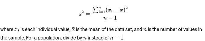
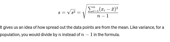
Standard Deviation: The square root of the variance provides a measure of the average distance from the mean. It’s like assessing the consistency of a baker’s cake sizes. It is represented as :
Before we move to the next basic statistics concept, here’s a Beginner’s Guide to Statistical Analysis for you!
4. Data Visualization
Data visualization is the art and science of telling stories with data. It turns complex results from our analysis into something tangible and understandable. It’s crucial for exploratory data analysis, where the goal is to uncover patterns, correlations, and insights from data without yet making formal conclusions.
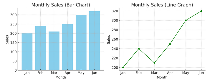
- Charts and Graphs: Starting with the basics, bar charts, line graphs, and pie charts provide foundational insights into the data. They are the ABCs of data visualization, essential for any data storyteller.
We have an example of a bar chart (left) and a line chart (right) below.
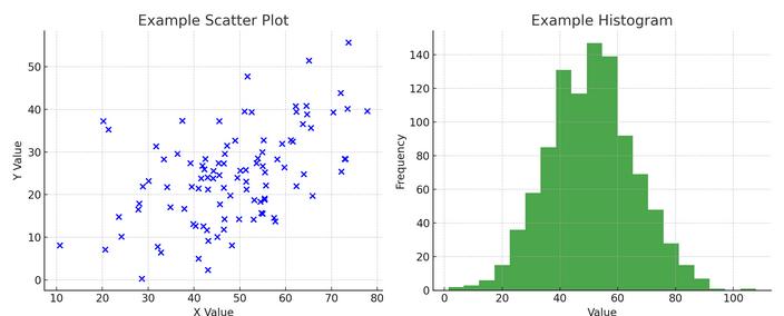
- Advanced Visualizations: As we dive deeper, heat maps, scatter plots, and histograms allow for more nuanced analysis. These tools help identify trends, distributions, and outliers.
Below is an example of a scatter plot and a histogram
Visualizations bridge raw data and human cognition, enabling us to interpret and make sense of complex datasets quickly.
5. Probability Basics
Probability is the grammar of the language of statistics. It’s about the chance or likelihood of events happening. Understanding concepts in probability is essential for interpreting statistical results and making predictions.
- Independent and Dependent Events:
- Independent Events: One event’s outcome does not affect another’s outcome. Like flipping a coin, getting heads on one flip doesn’t change the odds for the next flip.
- Dependent Events: The outcome of one event affects the result of another. For example, if you draw a card from a deck and don’t replace it, your chances of drawing another specific card change.
Probability provides the foundation for making inferences about data and is critical to understanding statistical significance and hypothesis testing.
6. Common Probability Distributions
Probability distributions are like different species in the statistics ecosystem, each adapted to its niche of applications.
- Normal Distribution: Often called the bell curve because of its shape, this distribution is characterized by its mean and standard deviation. It is a common assumption in many statistical tests because many variables are naturally distributed this way in the real world.
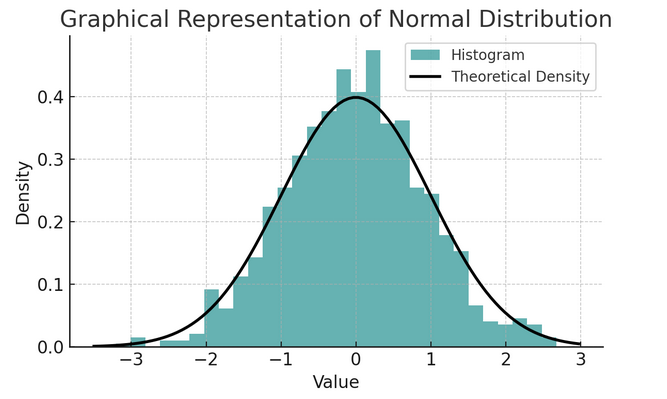
A set of rules known as the empirical rule or the 68-95-99.7 rule summarizes the characteristics of a normal distribution, which describes how data is spread around the mean.
68-95-99.7 Rule (Empirical Rule)
This rule applies to a perfectly normal distribution and outlines the following:
- 68% of the data falls within one standard deviation (σ) of the mean (μ).
- 95% of the data falls within two standard deviations of the mean.
- Approximately 99.7% of the data falls within three standard deviations of the mean.
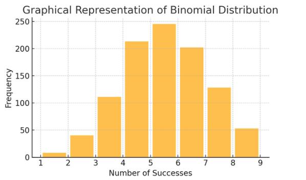
Binomial Distribution: This distribution applies to situations with two outcomes (like success or failure) repeated several times. It helps model events like flipping a coin or taking a true/false test.
Poisson Distribution counts the number of times something happens over a specific interval or space. It’s ideal for situations where events happen independently and constantly, like the daily emails you receive.

Each distribution has its own set of formulas and characteristics, and choosing the right one depends on the nature of your data and what you’re trying to find out. Understanding these distributions allows statisticians and data scientists to model real-world phenomena and predict future events accurately.
7 . Hypothesis Testing
Think of hypothesis testing as detective work in statistics. It’s a method to test if a particular theory about our data could be true. This process starts with two opposing hypotheses:
- Null Hypothesis (H0): This is the default assumption, suggesting therthere’seffect or difference. It’s saying, “Not” ing new here.”
- Al “alternative Hypothesis (H1 or Ha): This challenges the status quo, proposing an effect or a difference. It claims, “Something is interesting going on.”
Example: Testing if a new diet program leads to weight loss compared to not following any diet.
- Null Hypothesis (H0): The new diet program does not lead to weight loss (no difference in weight loss between those who follow the new diet program and those who do not).
- Alternative Hypothesis (H1): The new diet program leads to weight loss (a difference in weight loss between those who follow it and those who do not).
Hypothesis testing involves choosing between these two based on the evidence (our data).
Type I and II Error and Significance Levels:
- Type I Error: This happens when we incorrectly reject the null hypothesis. It convicts an innocent person.
- Type II Error: This occurs when we fail to reject a false null hypothesis. It lets a guilty person go free.
- Significance Level (α): This is the threshold for deciding how much evidence is enough to reject the null hypothesis. It’s often set at 5% (0.05), indicating a 5% risk of a Type I error.
8. Confidence Intervals
Confidence intervals give us a range of values within which we expect the valid population parameter (like a mean or proportion) to fall with a certain confidence level (commonly 95%). It’s like predicting a sports team’s final score with a margin of error; we’re saying, “We’re 95% confident the true score will be within this range.”
Constructing and interpreting confidence intervals helps us understand the precision of our estimates. The wider the interval, our estimate is less precise, and vice versa.
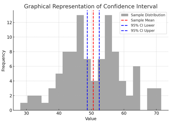
The above figure illustrates the concept of a confidence interval (CI) in statistics, using a sample distribution and its 95% confidence interval around the sample mean.
Here’s a breakdown of the critical components in the figure:
- Sample Distribution (Gray Histogram): This represents the distribution of 100 data points randomly generated from a normal distribution with a mean of 50 and a standard deviation of 10. The histogram visually depicts how the data points are spread around the mean.
- Sample Mean (Red Dashed Line): This line indicates the sample data’s mean (average) value. It serves as the point estimate around which we construct the confidence interval. In this case, it represents the average of all the sample values.
- 95% Confidence Interval (Blue Dashed Lines): These two lines mark the lower and upper bounds of the 95% confidence interval around the sample mean. The interval is calculated using the standard error of the mean (SEM) and a Z-score corresponding to the desired confidence level (1.96 for 95% confidence). The confidence interval suggests we are 95% confident that the population mean lies within this range.
9. Correlation and Causation
Correlation and causation often get mixed up, but they are different:
- Correlation: Indicates a relationship or association between two variables. When one changes, the other tends to change, too. Correlation is measured by a correlation coefficient ranging from -1 to 1. A value closer to 1 or -1 indicates a strong relationship, while 0 suggests no ties.
- Causation: It implies that changes in one variable directly cause changes in another. It is a more robust assertion than correlation and requires rigorous testing.
Just because two variables are correlated does not mean one causes the other. This is a classic case of not confusing “correlation” with “causation.”
10. Simple Linear Regression
Simple linear regression is a way to model the relationship between two variables by fitting a linear equation to observed data. One variable is considered an explanatory variable (independent), and the other is a dependent variable.
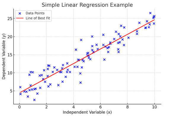
Simple linear regression helps us understand how changes in the independent variable affect the dependent variable. It’s a powerful tool for prediction and is foundational for many other complex statistical models. By analyzing the relationship between two variables, we can make informed predictions about how they will interact.
Simple linear regression assumes a linear relationship between the independent variable (explanatory variable) and the dependent variable. If the relationship between these two variables is not linear, then the assumptions of simple linear regression may be violated, potentially leading to inaccurate predictions or interpretations. Thus, verifying a linear relationship in the data is essential before applying simple linear regression.
11. Multiple Linear Regression
Think of multiple linear regression as an extension of simple linear regression. Still, instead of trying to predict an outcome with one knight in shining armor (predictor), you have a whole team. It’s like upgrading from a one-on-one basketball game to an entire team effort, where each player (predictor) brings unique skills. The idea is to see how several variables together influence a single outcome.
However, with a bigger team comes the challenge of managing relationships, known as multicollinearity. It occurs when predictors are too close to each other and share similar information. Imagine two basketball players constantly trying to take the same shot; they can get in each other’s way. Regression can make it hard to see each predictor’s unique contribution, potentially skewing our understanding of which variables are significant.
12. Logistic Regression
While linear regression predicts continuous outcomes (like temperature or prices), logistic regression is used when the result is definite (like yes/no, win/lose). Imagine trying to predict whether a team will win or lose based on various factors; logistic regression is your go-to strategy.
It transforms the linear equation so that its output falls between 0 and 1, representing the probability of belonging to a particular category. It’s like having a magic lens that converts continuous scores into a clear “this or that” view, allowing us to predict categorical outcomes.
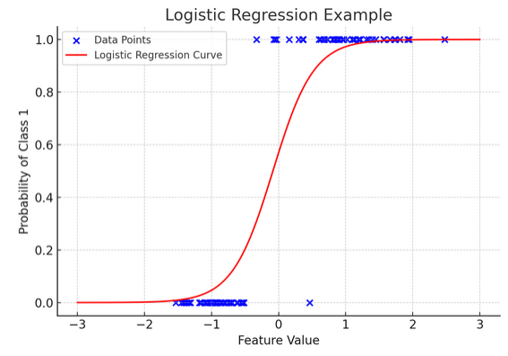
The graphical representation illustrates an example of logistic regression applied to a synthetic binary classification dataset. The blue dots represent the data points, with their position along the x-axis indicating the feature value and the y-axis indicating the category (0 or 1). The red curve represents the logistic regression model’s prediction of the probability of belonging to class 1 (e.g., “win”) for different feature values. As you can see, the curve transitions smoothly from the probability of class 0 to class 1, demonstrating the model’s ability to predict categorical outcomes based on an underlying continuous feature.
The formula for logistic regression is given by:

This formula uses the logistic function to transform the linear equation’s output into a probability between 0 and 1. This transformation allows us to interpret the outputs as probabilities of belonging to a particular category based on the value of the independent variable xx.
13. ANOVA and Chi-Square Tests
ANOVA (Analysis of Variance) and Chi-Square tests are like detectives in the statistics world, helping us solve different mysteries. It allows us to compare means across multiple groups to see if at least one is statistically different. Think of it as tasting samples from several batches of cookies to determine if any batch tastes significantly different.
On the other hand, the Chi-Square test is used for categorical data. It helps us understand if there’s a significant association between two categorical variables. For instance, is there a relationship between a person’s favorite genre of music and their age group? The Chi-Square test helps answer such questions.
14. The Central Limit Theorem and Its Importance in Data Science
The Central Limit Theorem (CLT) is a fundamental statistical principle that feels almost magical. It tells us that if you take enough samples from a population and calculate their means, those means will form a normal distribution (the bell curve), regardless of the population’s original distribution. This is incredibly powerful because it allows us to make inferences about populations even when we don’t know their exact distribution.
In data science, the CLT underpins many techniques, enabling us to use tools designed for normally distributed data even when our data doesn’t initially meet those criteria. It’s like finding a universal adapter for statistical methods, making many powerful tools applicable in more situations.
15. Bias-Variance Tradeoff
In predictive modeling and machine learning, the bias-variance tradeoff is a crucial concept that highlights the tension between two main types of error that can make our models go awry. Bias refers to errors from overly simplistic models that don’t capture the underlying trends well. Imagine trying to fit a straight line through a curved road; you’ll miss the mark. Conversely, Variances from too complex models capture noise in the data as if it were an actual pattern — like tracing every twist and turning on a bumpy trail, thinking it’s the path forward.
The art lies in balancing these two to minimize the total error, finding the sweet spot where your model is just right—complex enough to capture the accurate patterns but simple enough to ignore the random noise. It’s like tuning a guitar; it won’t sound right if it’s too tight or loose. The bias-variance tradeoff is about finding the perfect balance between these two. The bias-variance tradeoff is the essence of tuning our statistical models to perform their best in predicting outcomes accurately.
Conclusion
From statistical sampling to the bias-variance tradeoff, these principles are not mere academic notions but essential tools for insightful data analysis. They equip aspiring data scientists with the skills to turn vast data into actionable insights, emphasizing statistics as the backbone of data-driven decision-making and innovation in the digital age.
Have we missed any basic statistics concept? Let us know in the comment section below.
Explore our end to end statistics guide for data science to know about the topic!
- SEO Powered Content & PR Distribution. Get Amplified Today.
- PlatoData.Network Vertical Generative Ai. Empower Yourself. Access Here.
- PlatoAiStream. Web3 Intelligence. Knowledge Amplified. Access Here.
- PlatoESG. Carbon, CleanTech, Energy, Environment, Solar, Waste Management. Access Here.
- PlatoHealth. Biotech and Clinical Trials Intelligence. Access Here.
- Source: https://www.analyticsvidhya.com/blog/2024/03/basic-statistics-concepts/
- :has
- :is
- :not
- :where
- $UP
- 05
- 1
- 10
- 100
- 15%
- 180
- 352
- 50
- 55
- 66
- 7
- 95%
- a
- ability
- About
- above
- absence
- academic
- accurate
- accurately
- across
- actionable
- actual
- adapted
- adding
- affect
- affects
- age
- All
- allow
- Allowing
- allows
- almost
- along
- amounts
- an
- analysis
- analyzing
- and
- Another
- answer
- any
- applicable
- applications
- applied
- applies
- Applying
- ARE
- around
- Art
- Art and science
- article
- AS
- ask
- aspiring
- Assessing
- Association
- assumes
- assumption
- assumptions
- At
- attributes
- average
- Backbone
- Balance
- balancing
- bar
- based
- basic
- Basics
- Basketball
- BE
- because
- before
- Beginner
- behind
- Bell
- belonging
- below
- BEST
- between
- bias
- bigger
- binary
- blood
- Blue
- book
- bounds
- Breakdown
- BRIDGE
- bring
- Brings
- broad
- bumpy
- but
- by
- CAKE
- calculate
- calculated
- calculations
- called
- CAN
- Can Get
- capture
- car
- card
- case
- categorizing
- Category
- Cause
- causes
- Celsius
- Center
- central
- centuries
- certain
- challenge
- challenges
- Chance
- chances
- change
- Changes
- characteristics
- characterized
- Chart
- Charts
- choosing
- City
- claims
- class
- classic
- classification
- clear
- Close
- closer
- Cluster
- cognition
- Coin
- color
- come
- comes
- comment
- Common
- commonly
- compare
- compared
- comparison
- compiled
- complex
- components
- concept
- concepts
- Conclusions
- confidence
- confident
- confidently
- confusing
- considered
- consistency
- constantly
- construct
- continuous
- contribution
- conversely
- converts
- cookies
- correlated
- Correlation
- correlation coefficient
- correlations
- Corresponding
- could
- counts
- criteria
- critical
- crucial
- curve
- daily
- data
- data analysis
- data points
- data science
- data set
- data visualisation
- data visualization
- data-driven
- datasets
- Date
- dealing
- Deals
- Deciding
- Decision Making
- decisions
- deck
- deep
- deeper
- Default
- defined
- demonstrating
- dependent
- depends
- describe
- describes
- designed
- desired
- Determine
- deviation
- Diet
- difference
- different
- digital
- digital age
- directly
- dish
- Dispersion
- distance
- distributed
- distribution
- distributions
- dive
- dividing
- diving
- do
- does
- Doesn’t
- Dont
- draw
- drawing
- e
- each
- ecosystem
- effect
- effort
- emails
- emphasizing
- enabling
- end
- enough
- ensure
- Entire
- equation
- equip
- error
- Errors
- essence
- essential
- estimate
- estimates
- Ether (ETH)
- Even
- Event
- events
- Every
- everyone
- evidence
- exact
- example
- examples
- existed
- expect
- Explanatory
- Exploratory Data Analysis
- extend
- extension
- factors
- FAIL
- Failure
- Fall
- Falls
- false
- far
- Favorite
- Feature
- feels
- Figure
- final
- Find
- finding
- findings
- First
- fit
- fitting
- flavors
- Flip
- flipping
- follow
- following
- For
- form
- formal
- formula
- formulas
- Forward
- Foundation
- foundational
- Free
- frequently
- from
- front
- function
- fundamental
- fundamentally
- future
- game
- gather
- generated
- genre
- get
- getting
- Give
- given
- gives
- Go
- goal
- going
- good
- Grammar
- graphs
- gravity
- gray
- Group
- Group’s
- guide
- guilty
- hand
- happen
- Happening
- happens
- Hard
- Have
- having
- heads
- Heart
- height
- help
- helping
- helps
- here
- High
- highest
- highlights
- How
- However
- HTTPS
- human
- i
- idea
- ideal
- identify
- if
- ignore
- ii
- illustrates
- imagine
- implies
- importance
- in
- inaccurate
- include
- Income
- incorrectly
- incredibly
- independent
- independently
- indicates
- indicating
- indispensable
- influence
- information
- informative
- informed
- ING
- initially
- innocent
- Innovation
- insightful
- insights
- instance
- instead
- interact
- interesting
- interpreting
- interval
- into
- involves
- IT
- ITS
- jpg
- just
- Knight
- Know
- Knowing
- known
- labeling
- language
- larger
- largest
- lead
- leading
- Leads
- LEARN
- least
- left
- Lens
- less
- let
- Lets
- Level
- levels
- lies
- like
- likelihood
- LIMIT
- Line
- linear
- lines
- lose
- loss
- lower
- lowest
- magic
- Main
- make
- Making
- managing
- many
- Maps
- Margin
- mark
- mathematical
- max-width
- May..
- mean
- meaningful
- means
- measure
- measured
- measurement
- measurements
- measures
- measuring
- Meet
- mere
- method
- methods
- Middle
- minimize
- minimizing
- miss
- missed
- mixed
- model
- models
- more
- most
- Most Popular
- move
- much
- multiple
- Music
- nationality
- naturally
- Nature
- Need
- Neutral
- New
- next
- niche
- no
- Noise
- normal
- normally
- notions
- nuanced
- number
- numbers
- numerical
- objective
- observations
- observed
- occurring
- ocean
- Odds
- of
- often
- on
- ONE
- Options
- or
- order
- original
- Other
- our
- out
- Outcome
- outcomes
- outlines
- output
- outputs
- over
- overall
- own
- parameter
- part
- particular
- path
- Pattern
- patterns
- People
- perfect
- perfectly
- perform
- performance
- person
- picture
- plato
- Plato Data Intelligence
- PlatoData
- Play
- player
- players
- plot
- plus
- Point
- points
- Popular
- population
- populations
- position
- potentially
- powerful
- powerful tools
- powers
- Practical
- precise
- Precision
- predict
- predicting
- prediction
- Predictions
- Predictor
- Predicts
- Prices
- principle
- principles
- probabilities
- probability
- process
- Program
- properties
- proportion
- proposing
- provide
- provides
- providing
- qualitative
- qualities
- quantitative
- Questions
- quickly
- random
- randomly generated
- range
- ranging
- ranked
- rather
- rating
- Raw
- raw data
- real
- real world
- receive
- Red
- refers
- Regardless
- regression
- reject
- relationship
- Relationships
- reliable
- remains
- repeated
- replace
- represent
- representation
- representative
- represented
- representing
- represents
- requires
- restaurant
- result
- Results
- Reviews
- right
- rigorous
- Risk
- road
- robust
- root
- Rule
- rules
- same
- sample
- satisfaction
- satisfied
- say
- saying
- Scale
- scales
- Science
- scientists
- score
- scores
- Section
- see
- select
- SEM
- sense
- serves
- set
- several
- Shape
- Share
- shining
- shot
- should
- significance
- significant
- significantly
- similar
- Simple
- simplest
- simplistic
- single
- situations
- sizes
- skills
- smaller
- smallest
- smoothly
- So
- SOLVE
- some
- something
- Sound
- Space
- specific
- Sports
- Spot
- spread
- square
- standard
- Starting
- starts
- statistical
- statistically
- statistics
- Status
- Still
- Stories
- storyteller
- straight
- straightforward
- Strategy
- strong
- subjective
- success
- such
- Suggests
- Survey
- sweet
- synthetic
- Take
- taking
- tangible
- tastes
- team
- techniques
- tell
- telling
- tells
- tendency
- tends
- test
- Testing
- tests
- than
- that
- The
- The Basics
- their
- then
- theorem
- theory
- There.
- These
- they
- Think
- Thinking
- this
- those
- three
- threshold
- Through
- Thus
- Ties
- times
- to
- today’s
- together
- too
- tool
- tools
- top
- Total
- Tracing
- tradeoff
- trail
- Transform
- Transformation
- transforms
- transitions
- Trends
- trick
- tries
- true
- trying
- tuning
- TURN
- Turning
- turns
- Twice
- twist
- two
- type
- types
- typical
- uncover
- underlying
- understand
- understandable
- understanding
- unique
- Universal
- us
- use
- used
- users
- uses
- using
- valid
- value
- Values
- variable
- variables
- various
- Vast
- verifying
- versa
- vice
- View
- violated
- visualization
- visually
- want
- Way..
- we
- Website
- weight
- WELL
- were
- What
- when
- whether
- which
- while
- WHO
- whole
- why
- wider
- will
- win
- with
- within
- without
- Work
- world
- yet
- you
- Your
- zephyrnet
- zero