Image generated with Segmind SSD-1B Model
When you’re analyzing data with pandas, you’ll use pandas functions for filtering and transforming the columns, joining data from multiple dataframes, and the like.
But it can often be helpful to generate plots—to visualize the data in the dataframe—rather than just looking at the numbers.
Pandas has several plotting functions you can use for quick and easy data visualization. And we’ll go over them in this tutorial.
🔗 Link to Google Colab notebook (if you’d like to code along).
Let’s create a sample dataframe for analysis. We’ll create a dataframe called df_employees containing employee records.
We’ll use Faker and the NumPy’s random module to populate the dataframe with 200 records.
Note: If you don’t have Faker installed in your development environment, you can install it using pip: pip install Faker.
Run the following snippet to create and populate df_employees with records:
import pandas as pd
from faker import Faker
import numpy as np # Instantiate Faker object
fake = Faker()
Faker.seed(27) # Create a DataFrame for employees
num_employees = 200
departments = ['Engineering', 'Finance', 'HR', 'Marketing', 'Sales', 'IT'] years_with_company = np.random.randint(1, 10, size=num_employees)
salary = 40000 + 2000 * years_with_company * np.random.randn() employee_data = { 'EmployeeID': np.arange(1, num_employees + 1), 'FirstName': [fake.first_name() for _ in range(num_employees)], 'LastName': [fake.last_name() for _ in range(num_employees)], 'Age': np.random.randint(22, 60, size=num_employees), 'Department': [fake.random_element(departments) for _ in range(num_employees)], 'Salary': np.round(salary), 'YearsWithCompany': years_with_company
} df_employees = pd.DataFrame(employee_data) # Display the head of the DataFrame
df_employees.head(10)
We have set the seed for reproducibility. So every time you run this code, you’ll get the same records.
Here are the first view records of the dataframe:

Output of df_employees.head(10)
Scatter plots are generally used to understand the relationship between any two variables in the dataset.
For the df_employees dataframe, let’s create a scatter plot to visualize the relationship between the age of the employee and the salary. This will help us understand if there is any correlation between the ages of the employees and their salaries.
To create a scatter plot, we can use plot.scatter() like so:
# Scatter Plot: Age vs Salary
df_employees.plot.scatter(x='Age', y='Salary', title='Scatter Plot: Age vs Salary', xlabel='Age', ylabel='Salary', grid=True)
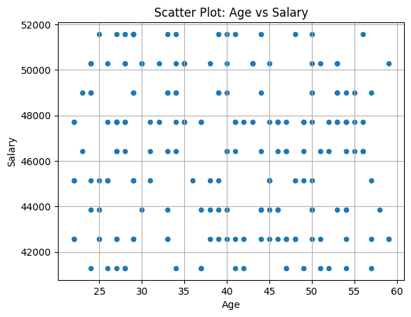
For this example dataframe, we do not see any correlation between the age of the employees and the salaries.
A line plot is suitable for identifying trends and patterns over a continuous variable which is usually time or a similar scale.
When creating the df_employees dataframe, we had defined a linear relationship between the number of years an employee has worked with the company and their salary. So let’s look at the line plot showing how the average salaries vary with the number of years.
We find the average salary grouped by the years with company, and then create a line plot with plot.line():
# Line Plot: Average Salary Trend Over Years of Experience
average_salary_by_experience = df_employees.groupby('YearsWithCompany')['Salary'].mean()
df_employees['AverageSalaryByExperience'] = df_employees['YearsWithCompany'].map(average_salary_by_experience) df_employees.plot.line(x='YearsWithCompany', y='AverageSalaryByExperience', marker='o', linestyle='-', title='Average Salary Trend Over Years of Experience', xlabel='Years With Company', ylabel='Average Salary', legend=False, grid=True)
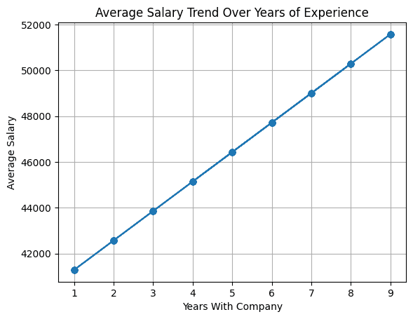
Because we choose to populate the salary field using a linear relationship to the number of years an employee has worked at the company, we see that the line plot reflects that.
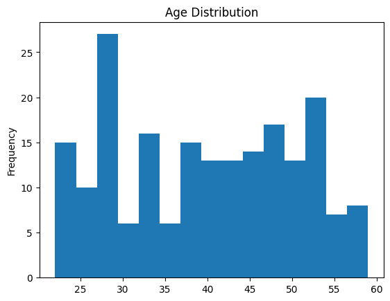
You can use histograms to visualize the distribution of continuous variables—by dividing the values into intervals or bins—and displaying the number of data points in each bin.
Let’s understand the distribution of ages of the employees using a histogram using plot.hist() as shown:
# Histogram: Distribution of Ages
df_employees['Age'].plot.hist(title='Age Distribution', bins=15)
A box plot is helpful in understanding the distribution of a variable, its spread, and for identifying outliers.
Let’s create a box plot to compare the distribution of salaries across different departments—giving a high-level comparison of salary distribution within the organization.
Box plot will also help identify the salary range as well as useful information such as the median salary and potential outliers for each department.
Here, we use boxplot of the ‘Salary’ column grouped by ‘Department’:
# Box Plot: Salary distribution by Department
df_employees.boxplot(column='Salary', by='Department', grid=True, vert=False)
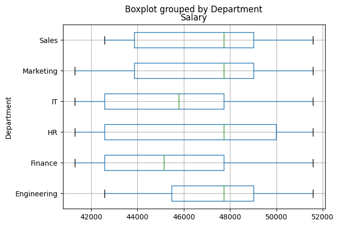
From the box plot, we see that some departments have a greater spread of salaries than others.
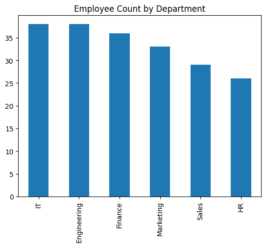
When you want to understand the distribution of variables in terms of frequency of occurrence, you can use a bar plot.
Now let’s create a bar plot using plot.bar() to visualize the number of employees:
# Bar Plot: Department-wise employee count
df_employees['Department'].value_counts().plot.bar(title='Employee Count by Department')
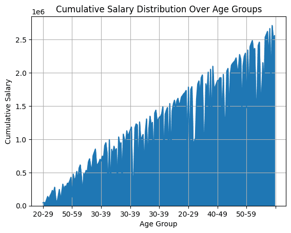
Area plots are generally used for visualizing the cumulative distribution of a variable over the continuous or categorical axis.
For the employees dataframe, we can plot the cumulative salary distribution over different age groups. To map the employees into bins based on age group, we use pd.cut().
We then find the cumulative sum of the salaries group the salary by ‘AgeGroup’. To get the area plot, we use plot.area():
# Area Plot: Cumulative Salary Distribution Over Age Groups
df_employees['AgeGroup'] = pd.cut(df_employees['Age'], bins=[20, 30, 40, 50, 60], labels=['20-29', '30-39', '40-49', '50-59'])
cumulative_salary_by_age_group = df_employees.groupby('AgeGroup')['Salary'].cumsum() df_employees['CumulativeSalaryByAgeGroup'] = cumulative_salary_by_age_group df_employees.plot.area(x='AgeGroup', y='CumulativeSalaryByAgeGroup', title='Cumulative Salary Distribution Over Age Groups', xlabel='Age Group', ylabel='Cumulative Salary', legend=False, grid=True)
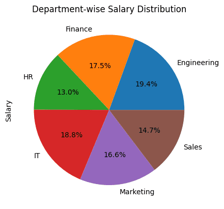
Pie Charts are helpful when you want to visualize the proportion of each of the categories within a whole.
For our example, it makes sense to create a pie chart that displays the distribution of salaries across departments within the organization.
We find the total salary of the employees grouped by the department. And then use plot.pie() to plot the pie chart:
# Pie Chart: Department-wise Salary distribution
df_employees.groupby('Department')['Salary'].sum().plot.pie(title='Department-wise Salary Distribution', autopct='%1.1f%%')
I hope you found a few helpful plotting functions you can use in pandas.
Yes, you can generate much prettier plots with matplotlib and seaborn. But for quick data visualization, these functions can be super handy.
What are some of the other pandas plotting functions that you use often? Let us know in the comments.
Bala Priya C is a developer and technical writer from India. She likes working at the intersection of math, programming, data science, and content creation. Her areas of interest and expertise include DevOps, data science, and natural language processing. She enjoys reading, writing, coding, and coffee! Currently, she’s working on learning and sharing her knowledge with the developer community by authoring tutorials, how-to guides, opinion pieces, and more.
- SEO Powered Content & PR Distribution. Get Amplified Today.
- PlatoData.Network Vertical Generative Ai. Empower Yourself. Access Here.
- PlatoAiStream. Web3 Intelligence. Knowledge Amplified. Access Here.
- PlatoESG. Carbon, CleanTech, Energy, Environment, Solar, Waste Management. Access Here.
- PlatoHealth. Biotech and Clinical Trials Intelligence. Access Here.
- Source: https://www.kdnuggets.com/7-pandas-plotting-functions-for-quick-data-visualization?utm_source=rss&utm_medium=rss&utm_campaign=7-pandas-plotting-functions-for-quick-data-visualization
- :has
- :is
- :not
- 1
- 10
- 11
- 13
- 20
- 200
- 2000
- 22
- 25
- 26
- 27
- 30
- 40
- 50
- 60
- 7
- 8
- 9
- a
- across
- age
- Ages
- along
- also
- an
- analysis
- analyzing
- and
- any
- ARE
- AREA
- areas
- AS
- At
- authoring
- average
- Axis
- bar
- based
- BE
- between
- BIN
- bins
- Box
- but
- by
- called
- CAN
- categories
- Chart
- Charts
- Choose
- code
- Coding
- Column
- Columns
- comments
- community
- company
- compare
- comparison
- content
- content-creation
- continuous
- Correlation
- create
- Creating
- creation
- Currently
- data
- data points
- data science
- data visualization
- defined
- Department
- departments
- Developer
- Development
- DevOps
- different
- Display
- displaying
- displays
- distribution
- do
- don
- each
- easy
- Employee
- employees
- Engineering
- Environment
- Every
- example
- experience
- expertise
- fake
- few
- field
- filtering
- finance
- Find
- First
- following
- For
- found
- Frequency
- from
- functions
- generally
- generate
- generated
- get
- Go
- greater
- Group
- Group’s
- Guides
- had
- handy
- Have
- head
- help
- helpful
- her
- high-level
- hope
- How
- hr
- HTML
- HTTPS
- identify
- identifying
- if
- import
- in
- include
- india
- information
- install
- installed
- interest
- intersection
- into
- IT
- ITS
- joining
- just
- KDnuggets
- Know
- knowledge
- language
- learning
- let
- like
- likes
- Line
- ll
- Look
- looking
- MAKES
- map
- Marketing
- math
- matplotlib
- more
- much
- multiple
- Natural
- Natural Language
- Natural Language Processing
- number
- numbers
- numpy
- object
- occurrence
- of
- often
- on
- Opinion
- or
- organization
- Other
- Others
- our
- over
- pandas
- patterns
- pieces
- plato
- Plato Data Intelligence
- PlatoData
- points
- potential
- processing
- Programming
- proportion
- Quick
- random
- range
- RE
- Reading
- records
- reflects
- relationship
- Run
- s
- salaries
- salary
- sales
- same
- Scale
- Science
- seaborn
- see
- seed
- sense
- set
- several
- sharing
- she
- showing
- shown
- similar
- Snippet
- So
- some
- spread
- such
- suitable
- sum
- Super
- T
- Technical
- terms
- than
- that
- The
- The Area
- their
- Them
- then
- There.
- These
- this
- time
- to
- Total
- transforming
- Trend
- Trends
- tutorial
- tutorials
- two
- understand
- understanding
- us
- use
- used
- useful
- using
- usually
- Values
- variable
- variables
- vary
- View
- visualization
- visualize
- vs
- want
- we
- WELL
- when
- which
- whole
- will
- with
- within
- worked
- working
- writer
- writing
- years
- you
- Your
- zephyrnet