Executive Summary
- Following a significant period of distribution into the ATH, a period of cooling down and consolidation has been underway, and sell-side pressure is winding back markedly.
- Alongside lighter sell-side activity, capital inflows remain relatively modest, although remain in a profit dominated regime and have been sufficient to stimulate local price action.
- Various measures of volatility have compressed over the course of this correction, which usually precede a larger scale market move, since equilibrium has been reached on-chain.
Supply Side Slows
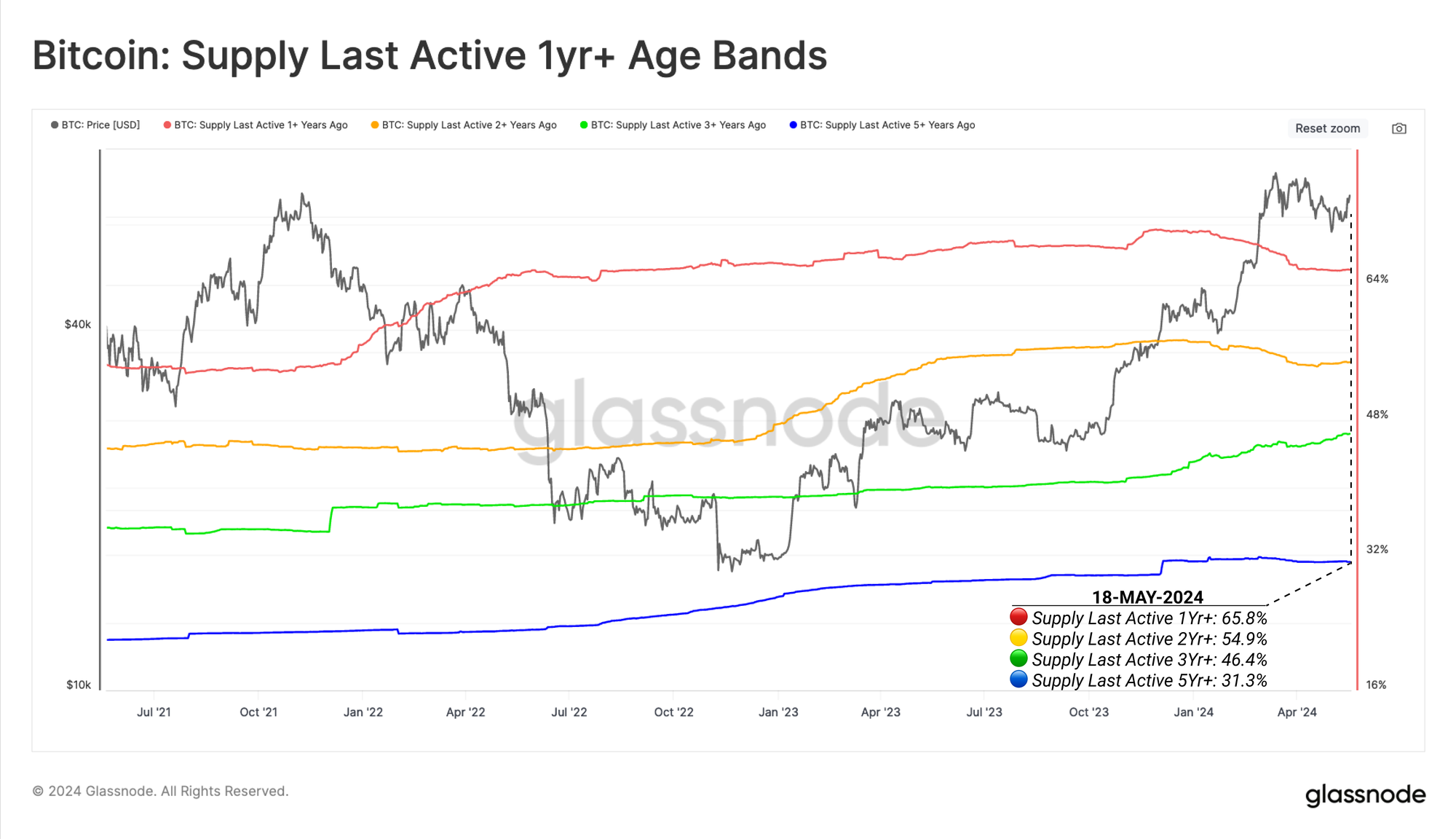
Strong Bitcoin markets naturally attract sell-side pressure, as higher prices motivate long-term holders to distribute some portion of their holdings. We can see this via the large decline in the Supply Last Active 1y and 2y throughout March and April, as longer-term investor cohorts distributed coins to satisfy new demand in the run up to the ATH.
However, the supply held by the 3y+ cohort continues to increase, suggesting this cohort are generally waiting for higher prices before parting ways with their coins. As of the time of writing, more than half of the Bitcoin coin supply hasn’t transacted onchain in the last 2yrs or more.
🔴 Supply Last Active 1y+: 65.8%
🟡 Supply Last Active 2y+: 54.9%
🟢 Supply Last Active 3y+: 46.4%
🔵 Supply Last Active 5y+: 31.3%
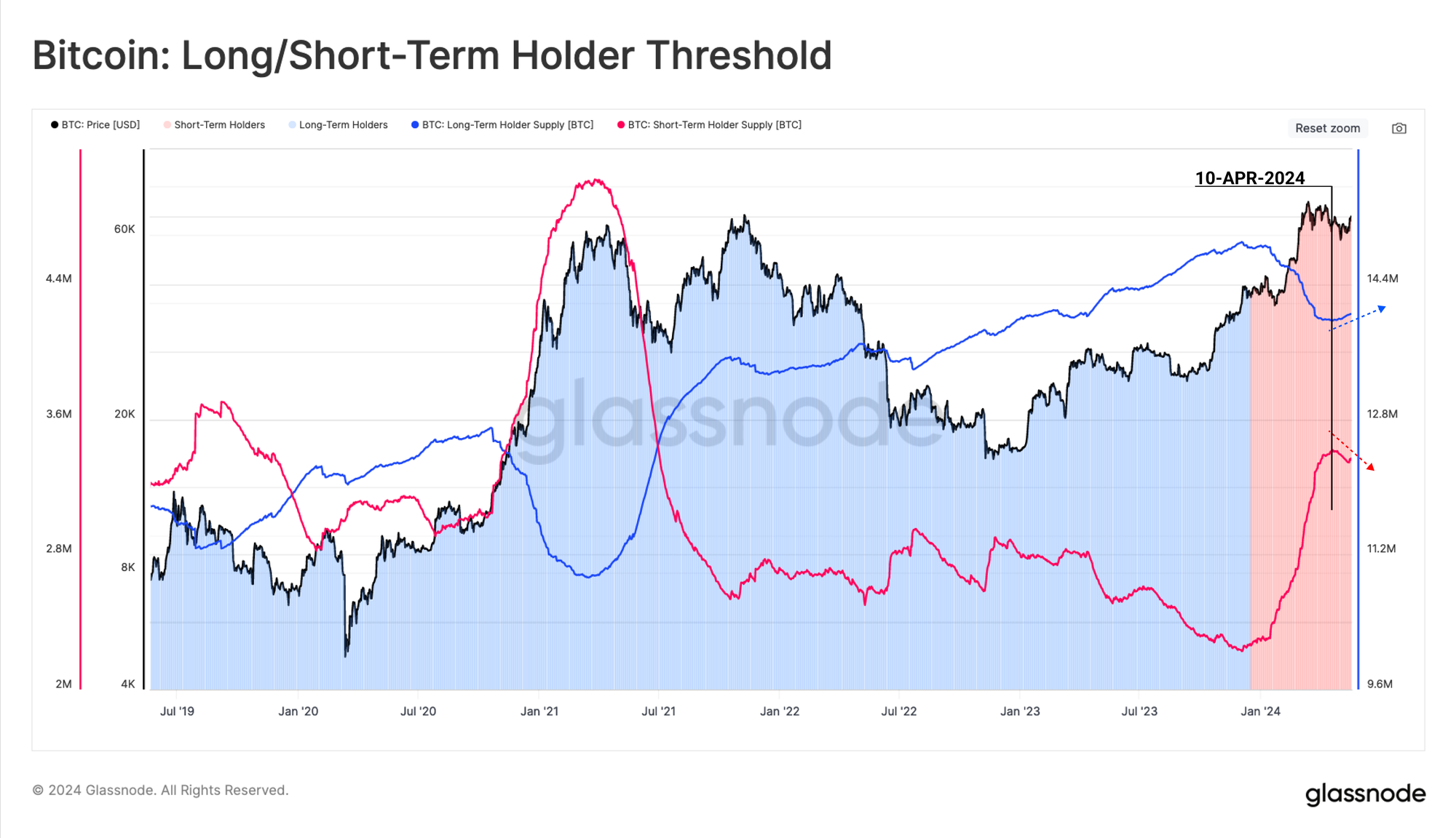
The Long-Term Holder (LTH) Binary Spending Indicator is another tool we can use to profile and visualize the intensity of HODLer distribution pressure. We note a significant and sustained decline in LTH Supply into the $73k ATH in March.
As of the last few weeks however, this distribution pressure has eased off markedly, giving the bulls more breathing room, and less resistance overall.
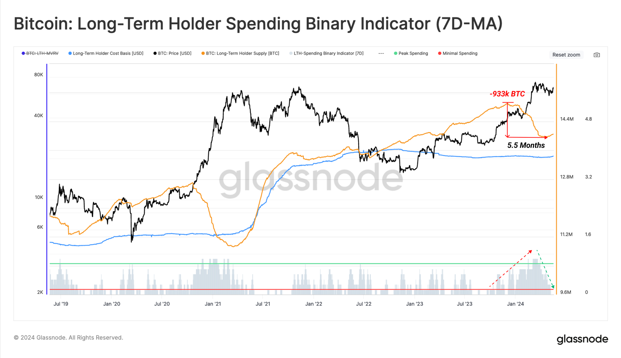
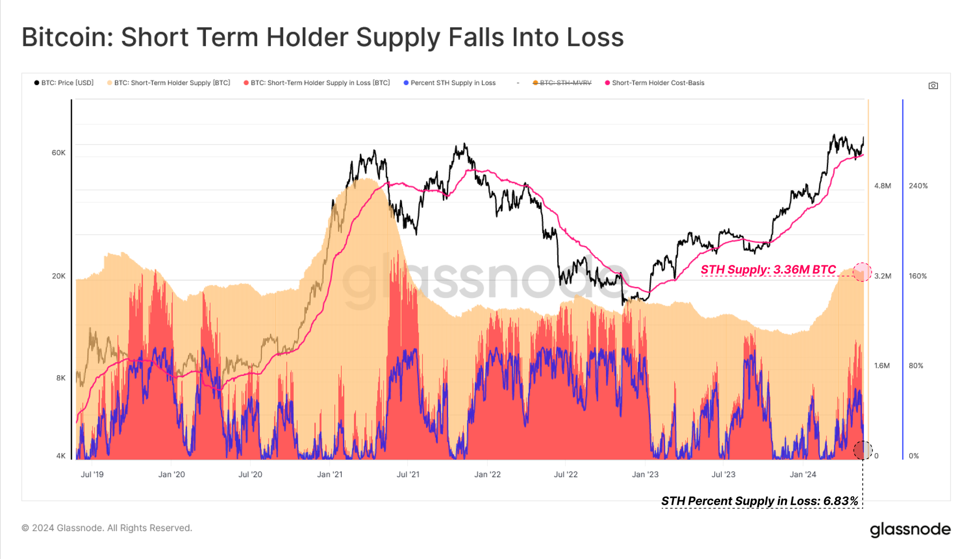
The flip side to a decrease in LTH Supply is, a sharp increase in supply held by Short-Term Holders (STHs), who represent new investors who have recently acquired coins.
A local divergence is starting to develop between LTH and STH Supply, which adds weight to the case that there is a cooling off of distribution pressure across mature investors.
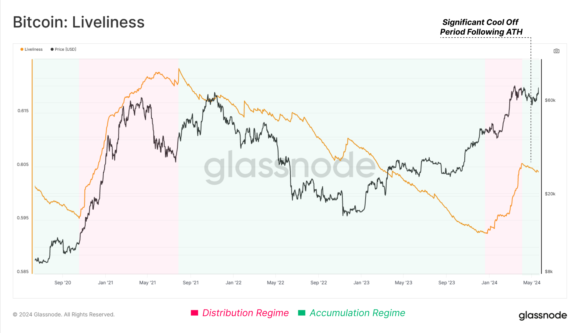
The Liveliness metric also captures this change in market character, and indicates that the Bitcoin network is seeing a greater volume of coinday creation than destruction. In other words, the market is now expressing a greater preference for holding coins for longer periods of time, rather than actively distributing coins for a profit.
Demand Side Remains Modest
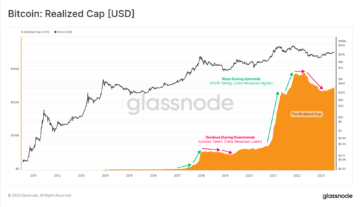
The Realized Cap is a metric unique to on-chain analytics, measuring the cumulative USD liquidity ‘stored’ within the asset class. It currently and resides at a value of $574B.
Currently, the rate at which new capital is flowing into the Bitcoin network has slowed down considerably from its peak as the market digests the recently distributed supply.
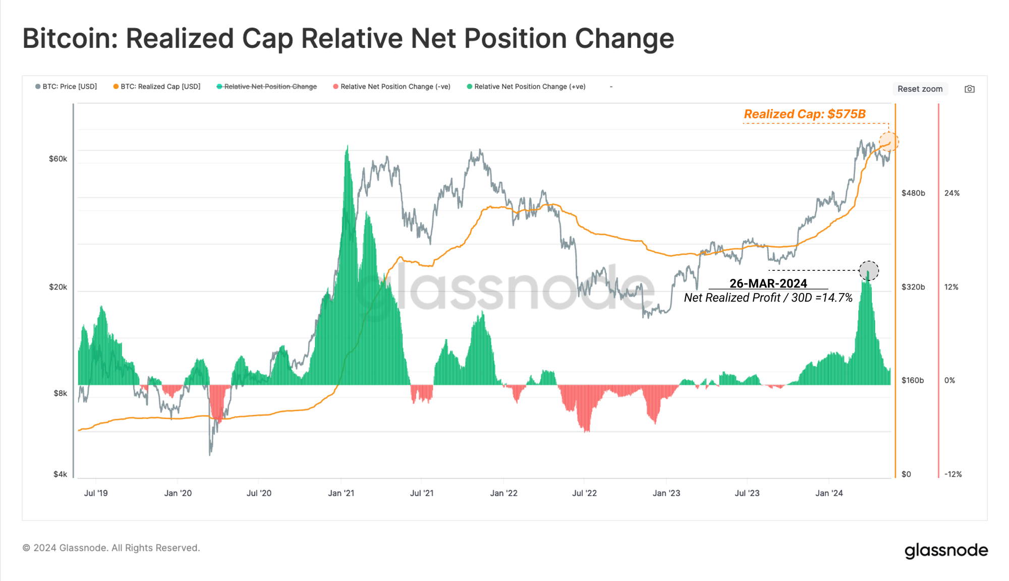
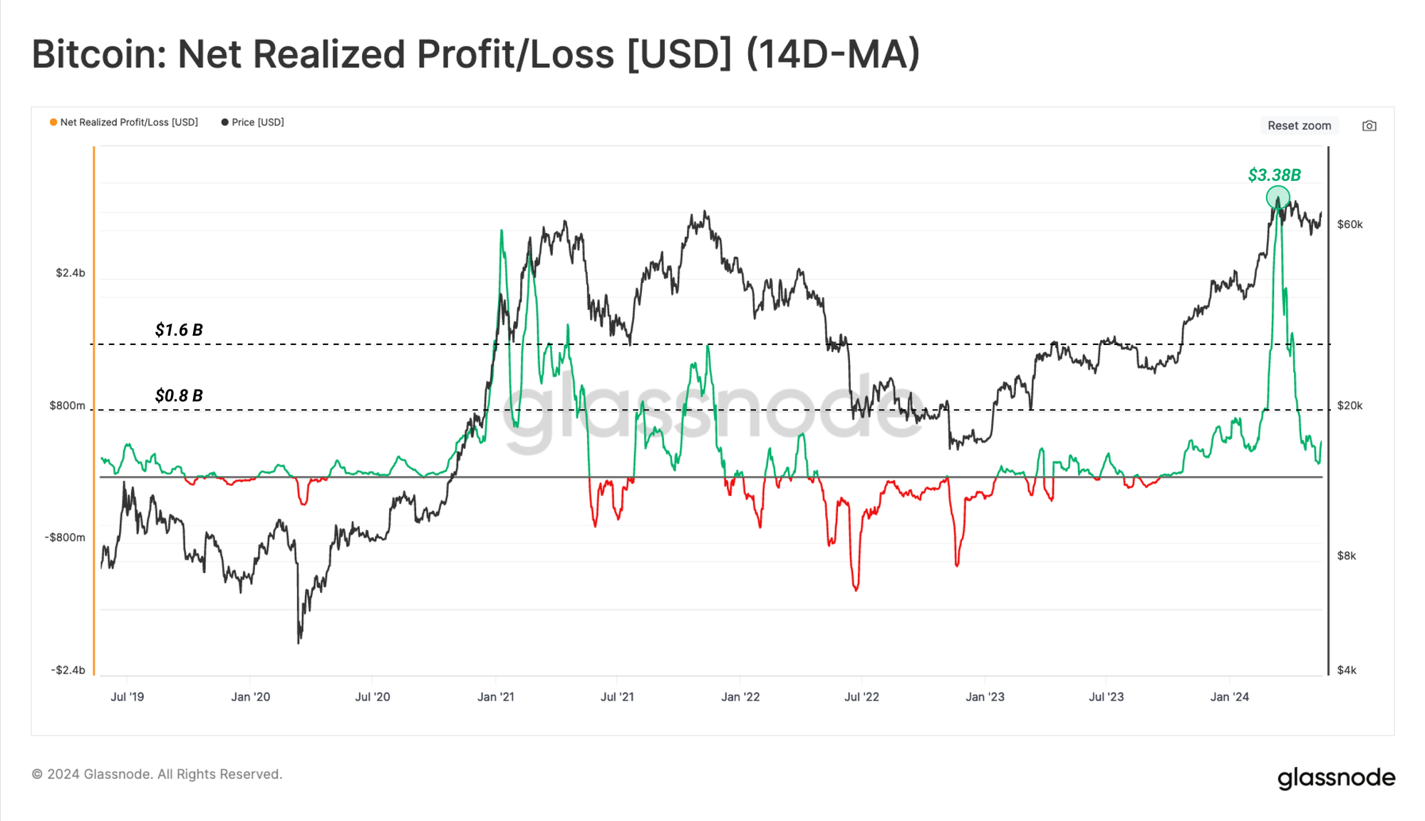
The rate at which the Realized Cap changes each day can therefore be used as a gauge for capital inflows. The recent injection of liquidity in the run up to the ATH was extremely sharp, culminating at a value of $3.38B/day. This surpassed the peak of the 2021 bull market, and has cooled off noticeably since.
Currently, this metric remains in positive profit dominated territory, and is returning towards an equilibrium position. However, with declining sell-side headwinds from mature investors, this wave of modest demand has been enough to stimulate price action.
Volatility Compression
With a lightening up of supply-side pressure, but also of capital inflows, it becomes prudent to turn towards our volatility tools to ground our expectations for the next move.
For this, we can employ the Sell-Side Risk metric, which evaluates the total value locked in by coins spent on-chain (Realized Profit + Realized Loss) in relation to the size of the asset class (Realized Cap).
- High values indicate that investors are spending coins at a large profit or loss relative to their cost basis. This condition indicates that the market likely needs to re-find equilibrium, and usually follows a high volatility price move.
- Low values indicate that the majority of coins are being spent relatively close to their break even cost basis, suggesting a degree of equilibrium has been reached. This condition often signifies an exhaustion of ‘profit and loss’ within the current price range, and usually describes a low volatility environment.
We can see a large decline in the Sell-Side Risk Ratio over recent weeks, which suggests the market has found a degree of equilibrium over the course of this correction.

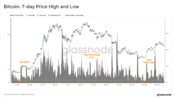
We can also assess market volatility by measuring the percent range between the highest and lowest price ticks over the last 60-days. By this metric, volatility continues to compress to levels typically seen after lengthy consolidations, and prior to large market moves.

Tracking Top Heaviness
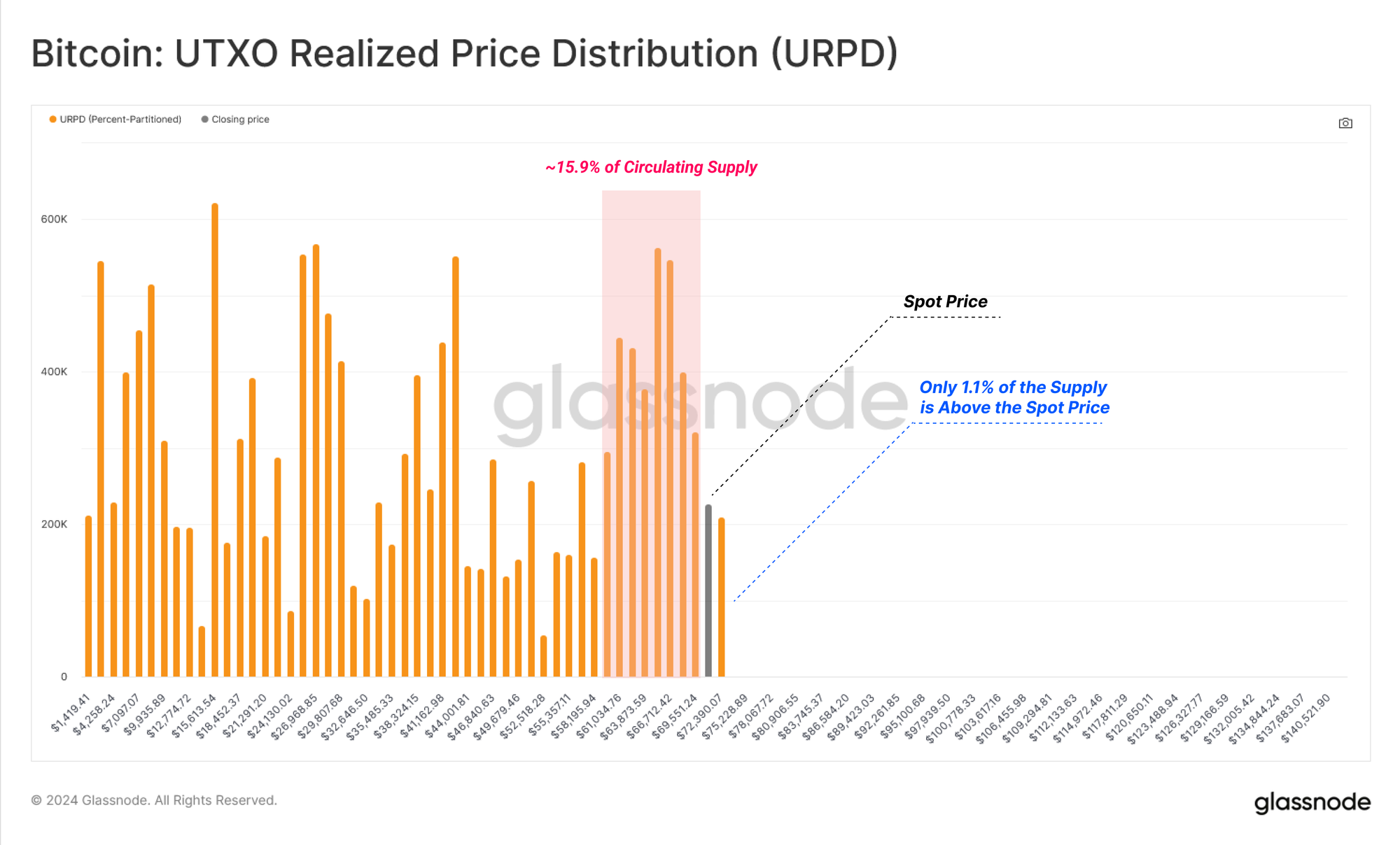
To close out, we can leverage the URPD metric to assess the density of coins with a cost basis around the current spot price. We use this concept to identify points of market sensitivity, where a market move could motivate a response from a large base of investors.
With price moving to the end of the distribution, we note that a substantial ~15.9% of the coin supply is held just below the current spot price, potentially providing a robust cluster of support.
Contrary to the dense cluster of coins below, only 1.1% of the circulating supply remains above our current spot price, suggesting a sustained inflow of demand could catalyze a period of price disovery.
STH supply is currently at 3.36M BTC, and during the recent correction, over 2.14M BTC fell into an unrealized loss (63.2%). However, as the market rallies back above $70k, this has decreased to just 230k BTC, which is approximately 6.8% of the total.
This suggests that despite the heavy concentration of coins near the current spot price, there are relatively few of them not held at an unrealized loss, which considerably reduces the risk of top heaviness developing.
Summary and Conclusions
Following an intense period of mature investor distribution into the $73K ATH, sell-side pressure has markedly declined. This has led to a reduction in headwinds and overhead resistance, with even only modest demand able to stimulate positive price action.
Alongside this, volatility continues to compress across longer timeframes, whilst a dense cluster of supply has formed below our current spot price, potentially providing a robust foundation to build upon.
Disclaimer: This report does not provide any investment advice. All data is provided for information and educational purposes only. No investment decision shall be based on the information provided here and you are solely responsible for your own investment decisions.
Exchange balances presented are derived from Glassnode’s comprehensive database of address labels, which are amassed through both officially published exchange information and proprietary clustering algorithms. While we strive to ensure the utmost accuracy in representing exchange balances, it is important to note that these figures might not always encapsulate the entirety of an exchange’s reserves, particularly when exchanges refrain from disclosing their official addresses. We urge users to exercise caution and discretion when utilizing these metrics. Glassnode shall not be held responsible for any discrepancies or potential inaccuracies. Please read our Transparency Notice when using exchange data.

- SEO Powered Content & PR Distribution. Get Amplified Today.
- PlatoData.Network Vertical Generative Ai. Empower Yourself. Access Here.
- PlatoAiStream. Web3 Intelligence. Knowledge Amplified. Access Here.
- PlatoESG. Carbon, CleanTech, Energy, Environment, Solar, Waste Management. Access Here.
- PlatoHealth. Biotech and Clinical Trials Intelligence. Access Here.
- Source: https://insights.glassnode.com/the-week-onchain-week-21-2024/
- :has
- :is
- :not
- :where
- $3
- $UP
- 1
- 2%
- 2000
- 2021
- 31
- 46
- 54
- 6
- 65
- a
- Able
- above
- accuracy
- acquired
- across
- Action
- active
- actively
- activity
- address
- addresses
- Adds
- advice
- After
- algorithms
- All
- also
- Although
- always
- amassed
- an
- analytics
- and
- Another
- any
- approximately
- April
- ARE
- around
- AS
- assess
- asset
- asset class
- At
- ATH
- attract
- back
- balances
- base
- based
- basis
- BE
- becomes
- been
- before
- being
- below
- between
- binary
- Bitcoin
- Bitcoin Network
- both
- Break
- breathing
- BTC
- build
- bull
- Bull Market
- Bulls
- but
- by
- CAN
- cap
- capital
- captures
- case
- catalyze
- caution
- change
- Changes
- character
- circulating
- class
- Close
- Cluster
- clustering
- Cohort
- Coin
- Coins
- comprehensive
- compress
- concentration
- concept
- condition
- considerably
- consolidation
- continues
- Cost
- cost basis
- could
- course
- creation
- culminating
- Current
- Currently
- data
- Database
- day
- decision
- decisions
- Decline
- Declining
- decrease
- decreased
- Degree
- Demand
- dense
- density
- Derived
- describes
- Despite
- develop
- developing
- Disclosing
- discretion
- distribute
- distributed
- distributing
- distribution
- Divergence
- does
- dominated
- down
- during
- each
- educational
- end
- enough
- ensure
- entirety
- Environment
- Equilibrium
- Even
- exchange
- Exchanges
- Exercise
- expectations
- expressing
- extremely
- few
- Figures
- Flip
- Flowing
- follows
- For
- formed
- found
- Foundation
- from
- gauge
- generally
- Giving
- Glassnode
- greater
- Ground
- Half
- Have
- headwinds
- heavy
- Held
- here
- High
- higher
- highest
- holder
- holders
- holding
- Holdings
- However
- HTTPS
- identify
- important
- in
- In other
- Increase
- indicate
- indicates
- Indicator
- inflows
- information
- intense
- into
- investment
- investor
- Investors
- IT
- ITS
- just
- Labels
- large
- larger
- Last
- Led
- less
- levels
- Leverage
- lightening
- lighter
- likely
- Liquidity
- liveliness
- local
- locked
- long-term
- Long-term Holder
- long-term holders
- longer
- loss
- Low
- lowest
- Macro
- Majority
- March
- Market
- market move
- market moves
- market volatility
- Markets
- mature
- measures
- measuring
- metric
- Metrics
- might
- modest
- more
- motivate
- move
- moves
- moving
- naturally
- Near
- needs
- network
- New
- next
- no
- note
- Notice..
- noticeably
- now
- of
- off
- official
- Officially
- often
- on
- On-Chain
- Onchain
- only
- or
- Other
- our
- out
- over
- overall
- overhead
- own
- particularly
- Parting
- Peak
- percent
- period
- periods
- plato
- Plato Data Intelligence
- PlatoData
- points
- portion
- position
- positive
- potential
- potentially
- presented
- pressure
- price
- PRICE ACTION
- Prices
- Prior
- Profile
- Profit
- proprietary
- provide
- provided
- providing
- prudent
- published
- purposes
- rallies
- range
- Rate
- rather
- ratio
- reached
- Read
- realized
- recent
- recently
- reduces
- reduction
- regime
- relation
- relative
- relatively
- remain
- remains
- report
- represent
- representing
- reserves
- resides
- Resistance
- response
- responsible
- returning
- Risk
- robust
- Room
- Run
- satisfy
- Scale
- see
- seeing
- seen
- Sensitivity
- sharp
- short-term
- side
- significant
- signifies
- since
- Size
- slowed
- solely
- some
- Spending
- spent
- Spot
- Starting
- stimulate
- strive
- substantial
- sufficient
- Suggests
- supply
- supply last active
- supply-side
- support
- surpassed
- sustained
- territory
- than
- that
- The
- the information
- their
- Them
- There.
- therefore
- These
- this
- Through
- throughout
- time
- to
- tool
- tools
- top
- Total
- total value locked
- towards
- Transparency
- TURN
- typically
- Underway
- unique
- upon
- USD
- use
- used
- users
- using
- usually
- Utilizing
- utmost
- value
- via
- visualize
- Volatility
- volume
- Waiting
- was
- Wave
- ways
- we
- Weeks
- weight
- when
- which
- while
- Whilst
- WHO
- with
- within
- words
- writing
- you
- Your
- zephyrnet