You’ve probably noticed that creating visually stunning charts and graphs isn’t just about picking the right colors or shapes. The real magic happens behind the scenes, in the data that feeds those visuals.
But, how to get that data just right? Now SQL here—will be our key to the realm of data visualization. SQL helps you slice, dice, and prepare your data in a way that makes it shine in whatever visualization tool you’re using.
So, what’s in store for you in this read? We’ll start by showing how SQL can be used to prepare data for data visualization. We’ll then guide you through different types of visualizations and how to prepare data for each, and some of them will have an end product. All of this, is aimed at giving you the keys to create compelling visual stories. So grab your coffee, this is going to be a good one!
Before we dive into types of visualizations, let’s see how SQL prepares the data you’ll visualize. SQL is like a screenplay writer for your visual “movie,” fine-tuning the story you want to tell.
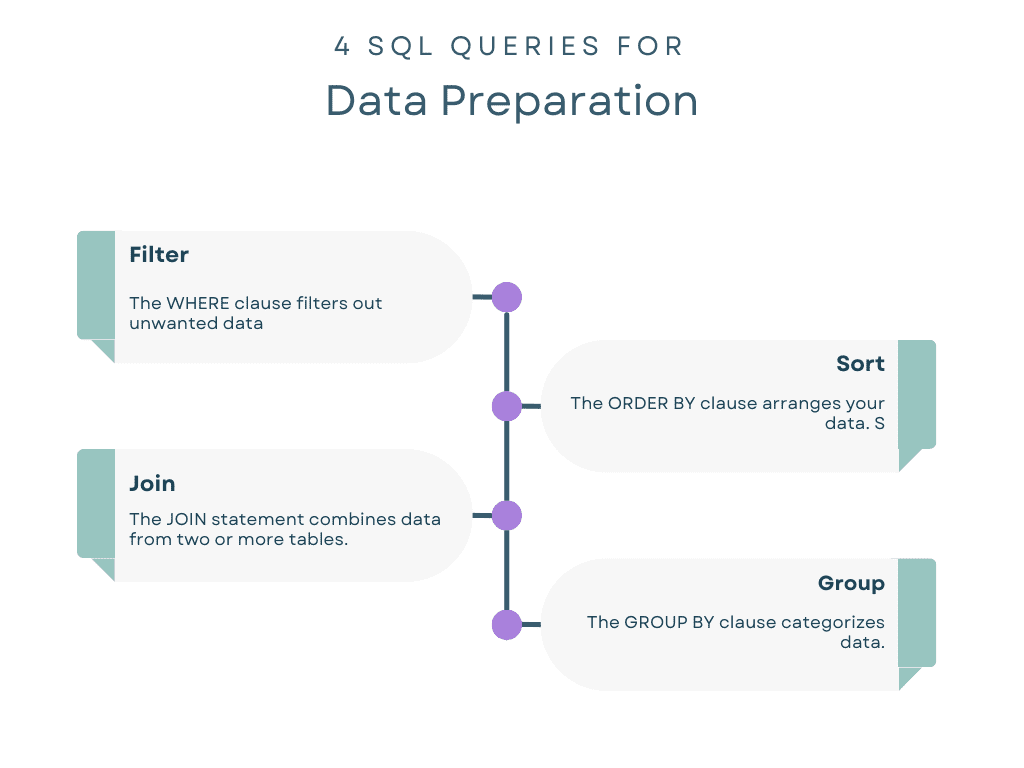
Filter
The WHERE clause filters out unwanted data. For instance, if you’re only interested in users aged 18-25 for your analysis, you could filter them out using SQL.
Imagine you’re analyzing customer feedback. Using SQL, you can filter only the records where the feedback rating is below 3, highlighting areas for improvement.
SELECT * FROM feedbacks WHERE rating 3;Sort
The ORDER BY clause arranges your data. Sorting can be crucial for time-series graphs where data must be displayed chronologically.
When plotting a line graph for a product’s monthly sales, SQL can sort data by month.
SELECT month, sales FROM products ORDER BY month;Join
The JOIN statement combines data from two or more tables. This allows for richer data sets and therefore, more comprehensive visualizations.
You might have user data in one table and purchase data in another. SQL can join these to show the total spending per user.
SELECT users.id, SUM(purchases.amount) FROM users
JOIN purchases ON users.id = purchases.user_id
GROUP BY users.id;
Group
The GROUP BY clause categorizes data. It’s often used with aggregate functions like COUNT(), SUM(), and AVG() to perform calculations on each group.
If you want to know the average time spent on different sections of a website, SQL can group data by section and then calculate the average.
SELECT section, AVG(time_spent) FROM website_data
GROUP BY section;
Before diving into the different types of visual aids, it’s important to understand why they are essential. Think of each chart or graph as a different “lens” to view your data. The type you choose can help you capture trends, identify outliers, or even tell a story.
Charts
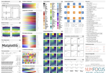
In data science, charts are used in the first steps in understanding a dataset. For example, you might use a histogram to understand the distribution of user ages in a mobile app. Tools like Matplotlib or Seaborn in Python are commonly used to plot these charts.
You can run SQL queries to get counts, averages, or whatever metric you’re interested in, and directly feed this data into your charting tool to create visualizations like bar charts, pie charts, or histograms.
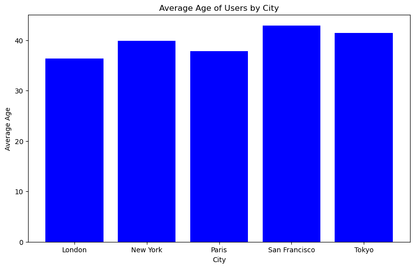
The following SQL query helps us to aggregate user ages by city. It’s essential for preparing the data so we can visualize how age varies from city to city.
# SQL code to find the average age of users in each city
SELECT city, AVG(age)
FROM users
GROUP BY city;
Let’s use Matplotlib to create a bar chart. The following code snippet assumes that grouped_df contains the average age data from the SQL query above, and creates bar charts that show the average age of users by city.
import matplotlib.pyplot as plt # Assuming grouped_df contains the average age data
plt.figure(figsize=(10, 6))
plt.bar(grouped_df['city'], grouped_df['age'], color='blue')
plt.xlabel('City')
plt.ylabel('Average Age')
plt.title('Average Age of Users by City')
plt.show()
Here is the bar chart.
Graphs
Let’s say you’re tracking the speed of a website over time. A line graph can show you trends, peaks, and valleys in the data, highlighting when the website performs best and worst.
Tools like Plotly or Bokeh can help you create these more complex visualizations. You would use SQL to prepare the time-series data, possibly running queries that calculate average loading time per day, before sending it to your graphing tool.
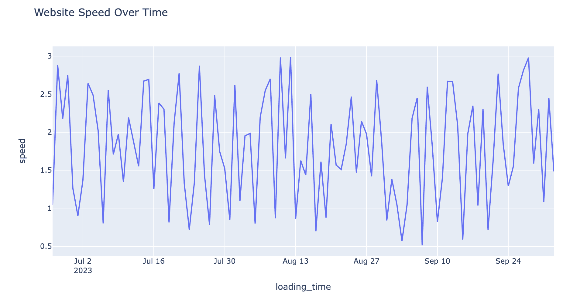
The following SQL query calculates the average website speed for each day. Such a query makes it easier to plot a time-series line graph, showing performance over time.
-- SQL code to find the daily average loading time
SELECT DATE(loading_time), AVG(speed)
FROM website_speed
GROUP BY DATE(loading_time);
Here, let’s say we choose Plotly to create a line graph that will display website speed over time. The SQL query prepared the time-series data for us, which shows website speed over time.
import plotly.express as px fig = px.line(time_series_df, x='loading_time', y='speed', title='Website Speed Over Time')
fig
Here is the line graph.
Dashboard
Dashboards are essential for projects that require real-time monitoring. Imagine a dashboard tracking real-time user engagement metrics for an online platform.
Tools like PowerBI, Google Data Studio, or Tableau can pull in data from SQL databases to populate these dashboards. SQL can aggregate and update your data, so you always have the latest insights right on your dashboard.
-- SQL code to find the current number of active users and average session time
SELECT COUNT(DISTINCT user_id) as active_users, AVG(session_time)
FROM user_sessions
WHERE session_end IS NULL;
In PowerBI, you would typically import your SQL database and run similar queries to create visuals for a dashboard. The benefit of using a tool like PowerBI is the ability to create real-time dashboards. You could set up multiple tiles to show the average age and other KPIs, all updated in real-time.
Data visualization is not just about pretty charts and graphs; it’s about telling a compelling story with your data. SQL plays a critical role in scripting that story, helping you prepare, filter, and organize the data behind the scenes. Just like the gears in a well-oiled machine, SQL queries serve as the unseen mechanics that make your visualizations not only possible but insightful.
If you’re hungry for more hands-on experience, visit StrataScratch platform, which offers a wealth of resources to help you grow. From data science interview questions to practical data projects, StrataScratch is designed to sharpen your skills and help you land your dream job.
Nate Rosidi is a data scientist and in product strategy. He’s also an adjunct professor teaching analytics, and is the founder of StrataScratch, a platform helping data scientists prepare for their interviews with real interview questions from top companies. Connect with him on Twitter: StrataScratch or LinkedIn.
- SEO Powered Content & PR Distribution. Get Amplified Today.
- PlatoData.Network Vertical Generative Ai. Empower Yourself. Access Here.
- PlatoAiStream. Web3 Intelligence. Knowledge Amplified. Access Here.
- PlatoESG. Carbon, CleanTech, Energy, Environment, Solar, Waste Management. Access Here.
- PlatoHealth. Biotech and Clinical Trials Intelligence. Access Here.
- Source: https://www.kdnuggets.com/sql-for-data-visualization-how-to-prepare-data-for-charts-and-graphs?utm_source=rss&utm_medium=rss&utm_campaign=sql-for-data-visualization-how-to-prepare-data-for-charts-and-graphs
- :is
- :not
- :where
- $UP
- 10
- 11
- 12
- 7
- 8
- 9
- a
- ability
- About
- above
- active
- adjunct
- age
- aged
- Ages
- aggregate
- aids
- aimed
- All
- allows
- also
- always
- amount
- an
- analysis
- analytics
- analyzing
- and
- Another
- app
- ARE
- areas
- AS
- assumes
- At
- average
- bar
- BE
- before
- behind
- behind the scenes
- below
- benefit
- BEST
- Blue
- but
- by
- calculate
- calculates
- calculations
- CAN
- capture
- Chart
- charting
- Charts
- Choose
- City
- code
- Coffee
- combines
- commonly
- Companies
- compelling
- compelling story
- complex
- comprehensive
- Connect
- contains
- could
- create
- creates
- Creating
- critical
- crucial
- Current
- customer
- daily
- dashboard
- dashboards
- data
- data science
- data scientist
- data sets
- data visualization
- Database
- databases
- day
- designed
- different
- directly
- Display
- displayed
- distinct
- distribution
- dive
- diving
- dream
- each
- easier
- end
- engagement
- essential
- Ether (ETH)
- Even
- example
- experience
- express
- feedback
- feedbacks
- Fig
- filter
- filters
- Find
- First
- first steps
- following
- For
- founder
- from
- functions
- gears
- get
- Giving
- going
- good
- grab
- graph
- graphs
- Group
- Grow
- guide
- hands-on
- happens
- Have
- he
- help
- helping
- helps
- highlighting
- him
- How
- How To
- HTTPS
- Hungry
- ID
- identify
- if
- imagine
- import
- important
- improvement
- in
- insightful
- insights
- instance
- interested
- Interview
- interview questions
- Interviews
- into
- isn
- IT
- Job
- join
- jpg
- just
- KDnuggets
- Key
- keys
- Know
- Land
- latest
- Lens
- like
- Line
- ll
- loading
- machine
- magic
- make
- MAKES
- matplotlib
- mechanics
- metric
- Metrics
- might
- Mobile
- Mobile app
- monitoring
- Month
- monthly
- more
- movie
- multiple
- must
- now
- number
- of
- Offers
- often
- on
- ONE
- online
- only
- or
- order
- Other
- our
- out
- over
- per
- perform
- performance
- performs
- platform
- plato
- Plato Data Intelligence
- PlatoData
- plays
- possible
- possibly
- Practical
- Prepare
- prepared
- Prepares
- preparing
- pretty
- probably
- Product
- Products
- Professor
- projects
- purchase
- purchases
- Python
- queries
- Questions
- rating
- RE
- Read
- real
- Real Magic
- real-time
- realm
- records
- require
- Resources
- right
- Role
- Run
- running
- s
- sales
- say
- scenes
- Science
- Scientist
- scientists
- seaborn
- Section
- sections
- see
- sending
- serve
- session
- set
- Sets
- shapes
- shine
- show
- showing
- Shows
- similar
- skills
- Slice
- Snippet
- So
- some
- speed
- Spending
- spent
- SQL
- start
- Statement
- Steps
- store
- Stories
- Story
- Strategy
- studio
- Stunning
- such
- T
- table
- Tableau
- Teaching
- tell
- telling
- that
- The
- their
- Them
- then
- therefore
- These
- they
- Think
- this
- those
- Through
- time
- to
- tool
- tools
- top
- Total
- Tracking
- Trends
- two
- type
- types
- typically
- understand
- understanding
- unwanted
- Update
- updated
- us
- use
- used
- User
- users
- using
- Ve
- View
- Visit
- visualization
- visualize
- visually
- visuals
- want
- Way..
- we
- Wealth
- Website
- What
- whatever
- when
- which
- why
- will
- with
- Worst
- would
- writer
- you
- Your
- zephyrnet