Introduction
In data analysis, the ability to visually represent complex datasets is invaluable. Python, with its rich ecosystem of libraries, stands at the forefront of data visualization, offering tools that range from simple plots to advanced interactive diagrams. Among these, Seaborn distinguishes itself as a powerful statistical data visualization library, designed to make data exploration and understanding both accessible and aesthetically pleasing. This article examines one of data visualization’s fundamental tools— utilizing Box Plot in Python with Seaborn for insightful dataset representations.

Table of contents
Understanding Data Visualization in Python
Python’s data visualization benefits from a variety of libraries. These include Matplotlib, Seaborn, Plotly, and Pandas Visualization. Each has its own strengths for representing data. Visualization not only helps in analysis but also in conveying findings and spotting trends. Choosing a library depends on project needs. It can range from creating simple plots to building interactive web visuals.
Read this article to master Box Plot in Python using Seaborn!
Introduction to Seaborn as a Statistical Data Visualization Library
Seaborn builds on Matplotlib, integrating closely with Pandas DataFrames to offer a high-level interface for drawing attractive and informative statistical graphics. It simplifies the process of creating complex visualizations and provides default styles and color palettes to make graphs more visually appealing and readable. Seaborn excels in creating complex plots with minimal code, making it a preferred choice for statisticians, data scientists, and analysts.
Definition and Significance of Box Plots in Data Analysis
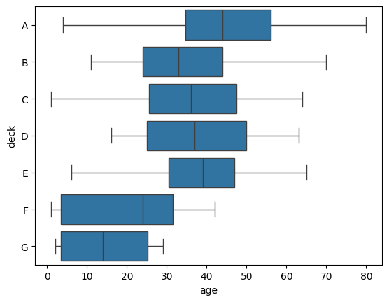
A box plot, also known as a box-and-whisker plot, is a standardized way of displaying the distribution of data based on a five-number summary: minimum, first quartile (Q1), median, third quartile (Q3), and maximum. It can also indicate outliers in the dataset. The box represents the interquartile range (IQR), the line inside the box shows the median, and the “whiskers” extend to show the range of the data, excluding outliers. Box plots are significant for several reasons:
- Efficient Summary: They provide a succinct summary of the data distribution and variability without overwhelming details, making them ideal for preliminary data analysis.
- Comparison: Box plots allow for easy comparison between different datasets or groups within a dataset, highlighting differences in medians, IQRs, and overall data spread.
- Outlier Detection: They are instrumental in identifying outliers, which can be crucial for data cleaning or anomaly detection.
Box Plot using Seaborn
Seaborn’s boxplot function is a versatile tool for creating box plots, offering a wide array of parameters to customize the visualization to fit your data analysis needs. There are number of parameters used in boxplot function.
seaborn.boxplot(data=None, *, x=None, y=None, hue=None, order=None, hue_order=None, orient=None, color=None, palette=None, saturation=0.75, fill=True, dodge=’auto’, width=0.8, gap=0, whis=1.5, linecolor=’auto’, linewidth=None, fliersize=None, hue_norm=None, native_scale=False, log_scale=None, formatter=None, legend=’auto’, ax=None, **kwargs)
Let’s create a basic boxplot using Seaborn:
Here’s a breakdown of the key parameters you can use with Seaborn’s boxplot:
Basic Parameters
- x, y, hue: Inputs for plotting long-form data. x and y are names of variables in data or vector data. hue is used to identify different groups, adding another dimension to the plot for comparison.
- data: Dataset for plotting. Can be a Pandas DataFrame, array, or list of arrays.
Aesthetic Parameters
- order, hue_order: Specify the order of levels of the box plot. order affects the order of the boxes themselves if the data is categorical. hue_order controls the order of the hues when using a hue variable.
- orient: Orientation of the plot (‘v’ for vertical or ‘h’ for horizontal). It’s automatically determined based on the input variables if not specified.
- color: Color for all elements of the box plots. It can be useful when you need a different color scheme from the default one.
- palette: Colors to use for the different levels of the hue variable. It allows for custom color mapping for better distinction between groups.
- saturation: Proportion of the original saturation to draw colors. Lowering it may improve readability when using high-saturation colors.
Box Parameters
- width: Width of the full element (box and whiskers). Adjusting this can help when plotting many groups to avoid overlap or to make the plot easier to read.
- dodge: When using hue, setting dodge to False will plot the elements in the hue category next to each other. By default, it’s True, which means elements are dodged so each box is clearly separated.
Want to learn python for FREE? Enroll in our Introduction to Python program today!
Whisker and Outlier Parameters
- whis: Defines the reach of the whiskers to the beyond the first and third quartiles. It can be a sequence of percentiles (e.g., [5, 95]) specifying exact percentiles for the whiskers or a number indicating a proportion of the IQR (the default is 1.5).
- linewidth: Width of the gray lines that frame the plot elements.


Conclusion
In our exploration of box plots in Python using Seaborn, we’ve seen a powerful tool for statistical data visualization. Seaborn simplifies complex data into insightful box plots with its elegant syntax and customization options. These plots help identify central tendencies, variabilities, and outliers, making comparative analysis and data exploration efficient.
Using Seaborn’s box plots isn’t just about visuals; it’s about uncovering hidden narratives within your data. It makes complex information accessible and actionable. This journey is a stepping stone to mastering data visualization in Python, fostering further discovery and innovation.
We offer a range of free course on Data Visualization. Check them out here.
- SEO Powered Content & PR Distribution. Get Amplified Today.
- PlatoData.Network Vertical Generative Ai. Empower Yourself. Access Here.
- PlatoAiStream. Web3 Intelligence. Knowledge Amplified. Access Here.
- PlatoESG. Carbon, CleanTech, Energy, Environment, Solar, Waste Management. Access Here.
- PlatoHealth. Biotech and Clinical Trials Intelligence. Access Here.
- Source: https://www.analyticsvidhya.com/blog/2024/02/box-plot-in-python-using-seaborn/
- :has
- :is
- :not
- 1
- 5
- a
- ability
- About
- accessible
- actionable
- adding
- adjusting
- advanced
- affects
- All
- allow
- allows
- also
- among
- analysis
- Analysts
- and
- anomaly detection
- Another
- appealing
- ARE
- Array
- article
- AS
- At
- attractive
- automatically
- avoid
- based
- basic
- BE
- benefits
- Better
- between
- Beyond
- both
- Box
- boxes
- Breakdown
- Building
- builds
- but
- by
- CAN
- Category
- central
- choice
- choosing
- Cleaning
- clearly
- closely
- code
- color
- comparison
- complex
- comprehensive
- controls
- course
- create
- Creating
- crucial
- custom
- customization
- customize
- data
- data analysis
- data visualization
- datasets
- Default
- Defines
- depends
- designed
- details
- Detection
- determined
- diagrams
- differences
- different
- Dimension
- discovery
- displaying
- distinction
- distinguishes
- distribution
- Dodge
- draw
- drawing
- e
- each
- easier
- easy
- ecosystem
- efficient
- element
- elements
- enroll
- Ether (ETH)
- exact
- Examines
- excluding
- exploration
- extend
- false
- findings
- First
- fit
- For
- forefront
- fostering
- FRAME
- Free
- from
- full
- function
- fundamental
- further
- graphics
- graphs
- gray
- Group’s
- guide
- help
- helps
- here
- Hidden
- High
- high-level
- highlighting
- Horizontal
- HTTPS
- ideal
- identify
- identifying
- if
- improve
- in
- include
- indicate
- indicating
- information
- informative
- Innovation
- input
- inputs
- inside
- insightful
- instrumental
- Integrating
- interactive
- Interface
- into
- invaluable
- IT
- ITS
- itself
- journey
- jpg
- just
- Key
- known
- LEARN
- levels
- libraries
- Library
- Line
- lines
- List
- lowering
- make
- MAKES
- Making
- many
- mapping
- master
- Mastering
- matplotlib
- max-width
- maximum
- May..
- means
- minimal
- minimum
- more
- names
- narratives
- Need
- needs
- next
- number
- of
- offer
- offering
- on
- ONE
- only
- Options
- or
- order
- original
- Other
- our
- out
- outlier
- overall
- overlap
- overwhelming
- own
- pandas
- parameters
- plato
- Plato Data Intelligence
- PlatoData
- plot
- powerful
- preferred
- preliminary
- process
- Program
- project
- proportion
- provide
- provides
- Python
- Q1
- Q3
- range
- reach
- Read
- reasons
- represent
- representing
- represents
- Rich
- scheme
- scientists
- seaborn
- seen
- Sequence
- setting
- several
- show
- Shows
- significance
- significant
- Simple
- simplifies
- So
- specified
- specifying
- spotting
- spread
- standardized
- stands
- statistical
- stepping
- STONE
- strengths
- SUMMARY
- syntax
- tendencies
- that
- The
- Them
- themselves
- There.
- These
- they
- Third
- this
- to
- tool
- tools
- Trends
- true
- understanding
- use
- used
- useful
- using
- Utilizing
- variable
- variables
- variety
- vector
- versatile
- vertical
- visualization
- visually
- visuals
- Way..
- web
- when
- which
- wide
- will
- with
- within
- without
- X
- you
- Your
- zephyrnet