Introduction
Scatter plots are a powerful tool in a data scientist’s arsenal, allowing us to visualize the relationship between two variables. This blog will explore the ins and outs of creating stunning scatter Plot Visualization in Python using matplotlib. Scatter plots are invaluable for uncovering patterns, trends, and correlations within datasets, making them an essential component of exploratory data analysis.
Table of contents
Understanding the Basics of Scatter Plots:
Scatter plots are a fundamental visualization technique used to display the relationship between two numerical variables. They are particularly useful for identifying data patterns, trends, and correlations. The Matplotlib library provides a simple and intuitive way to create scatter plots in Python. Let’s dive into the basics of scatter plots and how to use Matplotlib to generate them.
Creating a Simple Scatter Plot
To create a simple scatter plot in Matplotlib, we can use the `scatter` function provided by the library. This function takes two arrays of data points – one for the x-axis and one for the y-axis – and plots them as individual points on the graph. Let’s follow a step-by-step example of creating a basic scatter plot using Matplotlib and Python.
Example
Creating a Scatter plot with IRIS Dataset
import matplotlib.pyplot as plt
# Load the iris dataset
from sklearn.datasets import load_iris
iris = load_iris()
# Extract data for sepal length and petal length
sepal_length = iris.data[:, 0]
petal_length = iris.data[:, 1]
# Create the scatter plot
plt.scatter(sepal_length, petal_length)
# Add labels, title, and grid
plt.xlabel("Sepal Length (cm)")
plt.ylabel("Petal Length (cm)")
plt.title("Sepal Length vs. Petal Length in Iris Dataset")
plt.grid(True)
# Show the plot
plt.show()
Output

Also read: A Beginner’s Guide to matplotlib for Data Visualization and Exploration in Python.
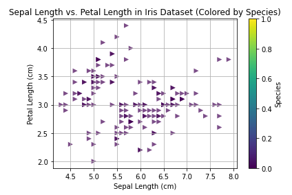
Customizing Scatter Plot Markers and Colors
One key advantage of using Matplotlib for scatter plots is the ability to customize the appearance of the data points. We can change the markers’ size, shape, and color to convey additional information or enhance the visual appeal of the plot. This section will explore various customization options available in Matplotlib for scatter plots.
Examples
The color is changed to red & markers are changed to ‘>’.
import matplotlib.pyplot as plt
# Load the iris dataset
from sklearn.datasets import load_iris
iris = load_iris()
# Extract data for sepal length and petal length
sepal_length = iris.data[:, 0]
petal_length = iris.data[:, 1]
# Color map for different species
# Create the scatter plot with customizations
plt.scatter(
    sepal_length,
    petal_length,
    c='red',  # Map colors based on species label
    s=50,  # Adjust marker size
    alpha=0.7,  # Set transparency
    linewidths=0,  # Remove border around markers (optional)
    marker='>'
)
# Add labels, title, and grid
plt.xlabel("Sepal Length (cm)")
plt.ylabel("Petal Length (cm)")
plt.title("Sepal Length vs. Petal Length in Iris Dataset")
plt.grid(True)
# Show the plot
plt.show()
Output

Different Colors we can use based on:
Named Colors like red, blue, green etc.
Example
plt.scatter(x, y, c='red') plt.scatter(x, y, c='blue') plt.scatter(x, y, c='green')RGB/RGBA Tuples
Example
plt.scatter(x, y, c=(1, 0, 0)) # Red plt.scatter(x, y, c=(0, 0, 1)) # Blue plt.scatter(x, y, c=(0, 1, 0)) # Green plt.scatter(x, y, c=(1, 0, 0, 0.5)) # Semi-transparent redHexadecimal Colors
Example
plt.scatter(x, y, c='#FF0000') # Red plt.scatter(x, y, c='#0000FF') # Blue plt.scatter(x, y, c='#00FF00') # GreenColormaps
Example
plt.scatter(x, y, c=y, cmap='viridis') # Use 'y' values to map colors plt.scatter(x, y, cmap='inferno') # Use a specific colormapDifferent markers that we can use are
| marker | description |
| “.” | point |
| “,” | pixel |
| “o” | circle |
| “v” | triangle_down |
| “^” | triangle_up |
| “<“ | triangle_left |
| “>” | triangle_right |
| “1” | tri_down |
| “2” | tri_up |
| “3” | tri_left |
| “4” | tri_right |
| “8” | octagon |
| “s” | square |
| “p” | pentagon |
| “P” | plus (filled) |
| “*” | star |
| “h” | hexagon1 |
| “H” | hexagon2 |
| “+” | plus |
| “x” | x |
| “X” | x (filled) |
| “D” | diamond |
| “d” | thin_diamond |
| “|” | vline |
| “_” | hline |
| 0 (TICKLEFT) | tickleft |
| 1 (TICKRIGHT) | tickright |
| 2 (TICKUP) | tickup |
| 3 (TICKDOWN) | tickdown |
| 4 (CARETLEFT) | caretleft |
| 5 (CARETRIGHT) | caretright |
| 6 (CARETUP) | caretup |
| 7 (CARETDOWN) | caretdown |
| 8 (CARETLEFTBASE) | caretleft (centered at base) |
| 9 (CARETRIGHTBASE) | caretright (centered at base) |
| 10 (CARETUPBASE) | caretup (centered at base) |
| 11 (CARETDOWNBASE) | caretdown (centered at base) |
Using colormaps based on specific column values in the dataset
import matplotlib.pyplot as plt
# Load the iris dataset
from sklearn.datasets import load_iris
iris = load_iris()
# Extract data for sepal length and petal length
sepal_length = iris.data[:, 0]
petal_length = iris.data[:, 1]
# Species labels (encoded numbers)
species = iris.target.astype(int)
# Color map for different species
cmap = plt.cm.get_cmap("viridis")  # Choose a colormap you like
# Create the scatter plot with customizations
plt.scatter(
sepal_length,
petal_length,
c=cmap(species),  # Map colors based on species label
s=50,  # Adjust marker size
alpha=0.7,  # Set transparency
linewidths=0,  # Remove border around markers (optional)
marker='>'
)
# Add labels, title, and grid
plt.xlabel("Sepal Length (cm)")
plt.ylabel("Petal Length (cm)")
plt.title("Sepal Length vs. Petal Length in Iris Dataset (Colored by Species)")
plt.grid(True)
# Colorbar for species mapping (optional)
sm = plt.cm.ScalarMappable(cmap=cmap)
sm.set_array([])
plt.colorbar(sm, label="Species")
# Show the plot
plt.show()
Output
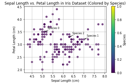
Adding Annotations and Text to Scatter Plots:
Annotations and text labels can provide valuable context and insights when visualizing data with scatter plots. Matplotlib offers a range of features to add annotations, text, and labels to the plot, allowing us to highlight specific data points or convey additional information. Let’s explore how to leverage these features to enhance the interpretability of scatter plots.
Annotating the different species in the above example.
import matplotlib.pyplot as plt
# Load the iris dataset
from sklearn.datasets import load_iris
iris = load_iris()
# Extract data for sepal length and petal length
sepal_length = iris.data[:, 0]
petal_length = iris.data[:, 1]
# Species labels (encoded numbers)
species = iris.target
# Color map for different species
cmap = plt.cm.get_cmap("viridis")
# Define marker shapes based on species (optional)
markers = ["o", "s", "^"]
# Create the scatter plot with customizations
plt.scatter(
sepal_length,
petal_length,
c=cmap(species),
s=50,
alpha=0.7,
linewidths=0,
marker='o',
)
# Add annotations to specific points (optional)
# Choose data points and text for annotations
annotate_indices = [0, 50, 100]  # Modify these indices as needed
annotate_texts = ["Species 0", "Species 1", "Species 2"]
for i, text in zip(annotate_indices, annotate_texts):
plt.annotate(
     text,
     xy=(sepal_length[i], petal_length[i]),
     xytext=(10, 10),  # Offset for placement
     textcoords="offset points",
     fontsize=8,
     arrowprops=dict(facecolor="red", arrowstyle="->"),
)
# Add a general title or label (optional)
plt.title("Sepal Length vs. Petal Length in Iris Dataset (Colored by Species)")
# Add labels and grid
plt.xlabel("Sepal Length (cm)")
plt.ylabel("Petal Length (cm)")
plt.grid(True)
# Colorbar for species mapping (optional)
sm = plt.cm.ScalarMappable(cmap=cmap)
sm.set_array([])
plt.colorbar(sm, label="Species")
# Show the plot
plt.show()
Output
Also read: Introduction to Matplotlib using Python for Beginners
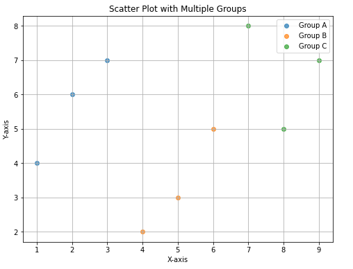
Handling Multiple Groups in Scatter Plots
In real-world scenarios, we often encounter datasets with multiple groups or categories. Visualizing multiple groups in a single scatter plot can help us compare the relationships between different variables and identify group patterns. Matplotlib provides several techniques to handle multiple groups in scatter plots, such as using different colors or markers for each group.
Example
import matplotlib.pyplot as plt
# Sample data (modify as needed)
groups = ["Group A", "Group B", "Group C"]
x_data = [[1, 2, 3], [4, 5, 6], [7, 8, 9]]
y_data = [[4, 6, 7], [2, 3, 5], [8, 5, 7]]
# Create the plot
plt.figure(figsize=(8, 6))  # Adjust figure size if needed
# Loop through groups and plot data points
for i, group in enumerate(groups):
plt.scatter(x_data[i], y_data[i], label=group, marker='o', alpha=0.7)
# Add labels, title, and legend
plt.xlabel("X-axis")
plt.ylabel("Y-axis")
plt.title("Scatter Plot with Multiple Groups")
plt.legend()
# Grid (optional)
plt.grid(True)
# Show the plot
plt.show()
Output
Conclusion
In this blog, we’ve delved into the world of scatter plot visualization using the Matplotlib library in Python. We’ve covered the basics of creating simple scatter plots, customizing markers and colors, adding annotations and text, and handling multiple groups. With this knowledge, you’re well-equipped to create scatter plots that effectively communicate insights from your data.
If you are looking for a Python course online, then explore: Learn Python for Data Science
Related
- SEO Powered Content & PR Distribution. Get Amplified Today.
- PlatoData.Network Vertical Generative Ai. Empower Yourself. Access Here.
- PlatoAiStream. Web3 Intelligence. Knowledge Amplified. Access Here.
- PlatoESG. Carbon, CleanTech, Energy, Environment, Solar, Waste Management. Access Here.
- PlatoHealth. Biotech and Clinical Trials Intelligence. Access Here.
- Source: https://www.analyticsvidhya.com/blog/2024/02/scatter-plot-visualization-in-python-using-matplotlib/
- :is
- 1
- 10
- 100
- 2%
- 4
- 5
- 50
- 6
- 7
- 8
- 9
- a
- ability
- above
- add
- adding
- Additional
- Additional Information
- adjust
- ADvantage
- Allowing
- an
- analysis
- and
- appeal
- ARE
- around
- Arsenal
- AS
- At
- available
- b
- base
- based
- basic
- Basics
- between
- Blog
- Blue
- border
- by
- CAN
- categories
- centered
- change
- changed
- Choose
- color
- Column
- communicate
- compare
- component
- context
- correlations
- course
- covered
- create
- Creating
- customization
- customize
- data
- data analysis
- data points
- data visualization
- datasets
- define
- different
- Display
- dive
- each
- effectively
- encounter
- enhance
- essential
- etc
- Ether (ETH)
- example
- exploration
- Exploratory Data Analysis
- explore
- extract
- Features
- Figure
- filled
- follow
- For
- from
- function
- fundamental
- General
- generate
- graph
- Green
- Grid
- Group
- Group’s
- guide
- handle
- Handling
- help
- High
- Highlight
- How
- How To
- HTTPS
- i
- identify
- identifying
- if
- import
- in
- Indices
- individual
- Inferno
- information
- insights
- into
- intuitive
- invaluable
- iris
- jpg
- Key
- knowledge
- Label
- Labels
- LEARN
- Length
- Leverage
- Library
- like
- load
- looking
- Making
- map
- mapping
- marker
- matplotlib
- max-width
- modify
- multiple
- needed
- numbers
- numerical
- of
- Offers
- offset
- often
- on
- ONE
- online
- Options
- or
- particularly
- patterns
- placement
- plato
- Plato Data Intelligence
- PlatoData
- plot
- points
- powerful
- provide
- provided
- provides
- Python
- range
- Read
- real world
- Red
- relationship
- Relationships
- remove
- s
- sample
- scenarios
- Section
- set
- several
- Shape
- shapes
- show
- Simple
- single
- Size
- specific
- Stunning
- such
- table
- takes
- Target
- technique
- techniques
- text
- that
- The
- The Basics
- The Graph
- the world
- Them
- then
- These
- they
- this
- Through
- Title
- to
- tool
- Transparency
- Trends
- true
- two
- us
- use
- used
- useful
- using
- Valuable
- Values
- variables
- various
- visual
- Visual appeal
- visualization
- visualize
- vs
- Way..
- we
- when
- will
- with
- within
- world
- X
- you
- Your
- zephyrnet